Decide whether the tiles or the pattern should stand out
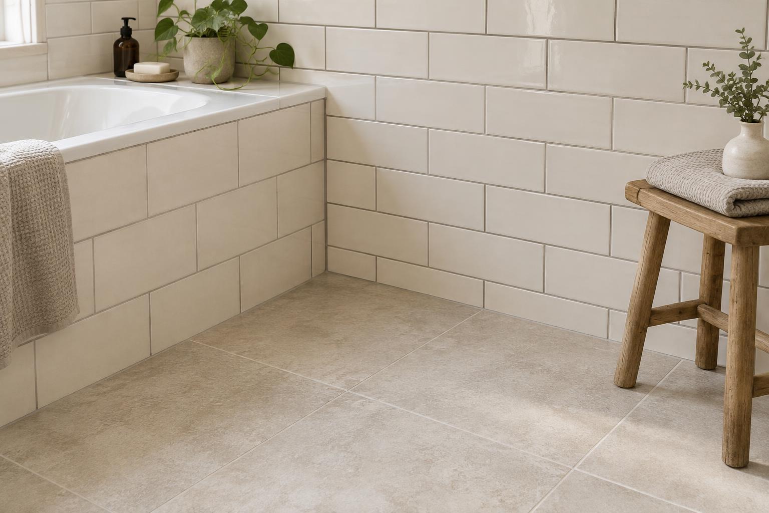
Grout is a small part of a tiled surface, but it can change how the whole surface reads. A colour close to the tile often makes individual pieces recede, creating a quieter backdrop. A contrasting colour outlines each tile and draws attention to its shape, size and layout. Neither approach is inherently better: the useful question is what you want to notice first when you enter the room.
If the room already has patterned wallpaper, prominent cabinetry or several decorative finishes, a close grout match can give the eye somewhere to rest. If the tiles are the main decorative feature, contrast can make a simple layout feel deliberate. Look at the full wall or floor rather than judging one tile in isolation; grout lines repeat across the entire area.
Compare close matches without expecting an exact match
Matching grout to tile is not always as simple as choosing “white” or “grey”. A warm white tile beside a cool white grout may make the joints look unexpectedly blue or stark. Beige, cream and grey tiles can also have undertones that only become obvious when two samples sit together. Compare grout samples directly against the tiles you plan to use, including any variation between tiles in the same batch.
A slightly lighter or darker grout may be more forgiving visually than a near-match with the wrong undertone. For tiles with varied colour, pick up one of the quieter tones if you want a cohesive result. Remember that a sample is only a guide: the finished appearance can vary with the product, installation and lighting. Check the grout manufacturer’s guidance and ask your installer about suitable options for the tile and location.
Use contrast to shape the look of the surface
Dark grout with light tiles can create a graphic grid, particularly when the tiles are small or the joints are numerous. It can suit a space where you want the tile layout to be a visible feature. The same contrast may feel busy across a large floor or a wall already filled with shelves, mirrors and fittings. Try to picture the repeated pattern at room scale, not just on a small sample board.
Tile shape matters too. Contrasting grout emphasises the edges of hexagons, narrow rectangles and other distinctive shapes. On tiles with irregular edges, it can also call attention to variations in the joints. If you prefer a softer effect but do not want the grout to disappear, consider a moderate contrast, such as a mid-tone grout with a pale tile.
Check samples in the room where they will be used
Place tile and grout samples beside the surfaces that will remain: flooring, cabinetry, worktops or painted walls. View them in daylight and with the room’s usual lights on. A grout that looks gently warm in a shop may appear quite different next to a cool-toned worktop or under a warm lamp. If possible, set out several tiles with visible gaps so you can judge the rhythm of the joints.
Move the samples to more than one part of the room. Light near a window can reveal colour differences that are less apparent in a shaded corner. On a floor, view the combination from standing height as well as up close. Take your time with this step, especially if you are considering strong contrast: a small colour difference becomes more noticeable when it is repeated across a large area.
Balance the look with practical upkeep
It is tempting to choose grout colour solely by what seems easiest to keep looking clean. Very pale grout may show some marks readily, while very dark grout may make pale residue or dust more visible. Mid-tone colours can sometimes make everyday variation less noticeable, but no colour removes the need for appropriate cleaning. The tile’s texture, the location and how the space is used also affect what you will see.
Before making a final choice, confirm that the grout product is appropriate for the tiles and for any wet area involved. Follow the product’s care guidance rather than assuming every grout needs the same treatment. Then return to the visual goal: choose a colour that supports the room you want to live with, not just the most striking sample on its own.