Start with the wall and the collection
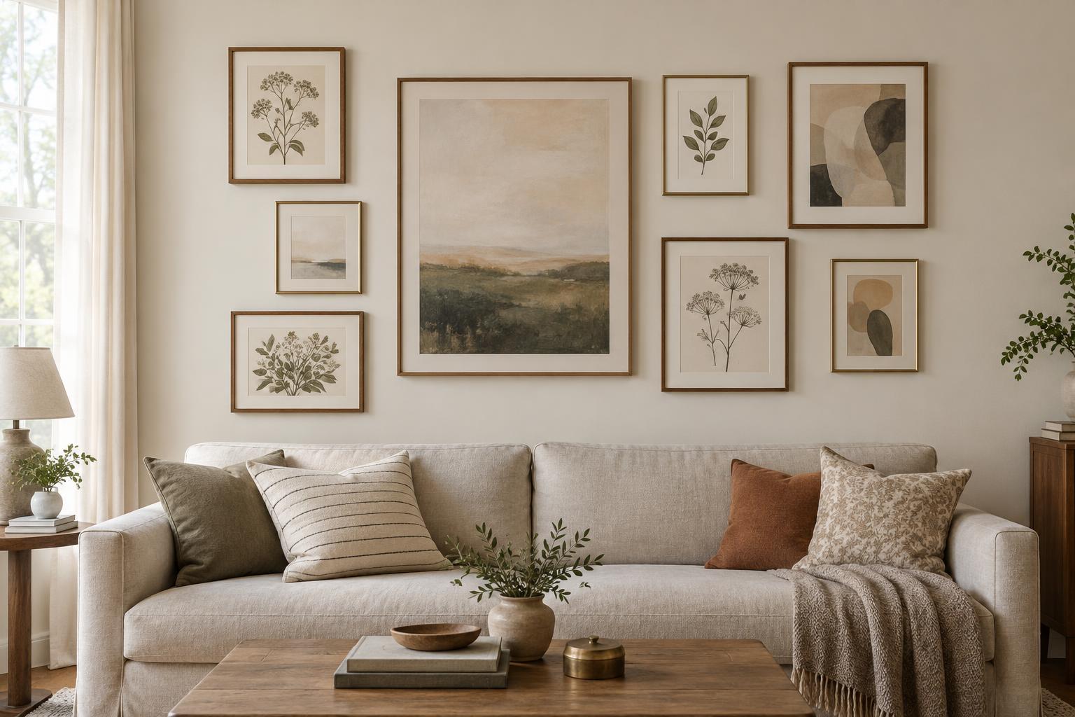
Before arranging frames, decide how much of the wall the gallery should occupy. A group above a sofa, console or bed usually looks more connected to the furniture when it sits within roughly the same width rather than stretching far beyond it. Leave enough open wall around the group for it to read as one arrangement. If the wall is empty, use painter’s tape to mark a possible outer boundary and step back to judge the scale.
Gather the pieces you want to display, including any objects with unusual shapes. Lay them on the floor and notice which are visually strongest: a large print, a dark frame or a colourful image can serve as an anchor. You do not need matching frames, but one or two shared qualities—such as a similar finish, palette or mat colour—can help varied pieces feel related.
Choose one spacing rule
Consistent spacing means measuring the visible gap between the outer edges of neighbouring frames, not the distance between their hanging hooks. For many small or medium frames, a gap of about 5 to 8 cm is a useful starting point. Smaller pieces may suit a tighter gap; larger pieces may need more room. The exact number matters less than repeating it wherever frames sit side by side.
A gallery wall with mixed sizes will not allow every gap to be identical, especially around an oval frame or a decorative object. Treat your chosen measurement as a guide for the main horizontal and vertical relationships. Then look at the whole group from across the room. If one opening looks like an accidental hole, adjust a nearby piece even if the ruler says the gap is correct.
Build the layout around an anchor
Place the largest or most important piece first, either near the centre or slightly off-centre for a more relaxed arrangement. Add neighbouring pieces outward, keeping your chosen gap in mind. You can align frame tops for an orderly look, line pieces up along an imaginary centre line or let the outer edge form a loose rectangle. Choosing one of these approaches gives the layout structure without requiring every frame to match.
Balance visual weight as you work. A dark image can feel heavier than a pale one of the same size, while a wide frame may balance two smaller pieces opposite it. Try not to cluster all the bold colours or thick frames on one side. Rearrange pieces on the floor until the group feels balanced and the spaces between them are easy to follow.
Test the arrangement on the wall
Cut paper to the outer dimensions of each frame and label every template. Tape the shapes to the wall in your planned positions, measuring the gaps between their edges. This makes it easier to check the arrangement at its actual height and see how it relates to nearby furniture, doors and lamps. Live with the templates for a day if you are unsure; a gap that looked fine on the floor may feel too wide on the wall.
When you are happy with the layout, mark each hanging point separately. The hook position may differ from the top edge of the frame depending on its hardware, so measure the distance from the frame’s top to the point where it will hang. Check that the planned fixings suit the wall and the weight of each piece before making holes.
Make small adjustments after hanging
Hang the anchor piece first, then work outward. Check each new frame against its neighbours rather than relying only on your original marks. A small shift can improve several gaps at once. A level helps keep straight frames aligned, but the final arrangement should also look balanced from the places where you normally view it.
Once everything is up, step back before adding more. Empty space is part of the design: filling every opening can make the wall feel crowded and weaken the spacing you planned. If you expect to swap artwork later, keep a note of your gap measurement and the collection’s outer boundary. Those two guides make it easier to refresh the display without starting from scratch.