Start with the clock’s everyday job
Before choosing a clock for its colour or shape, decide how you will use it. A clock seen from across a kitchen needs a face you can read at a glance. One on a bedside shelf may be viewed only from a short distance. If it is mainly decorative, you can give more weight to its materials and silhouette, but it should still be reasonably easy to tell the time.
Think about the room’s habits, too. In a quiet bedroom or study, a ticking mechanism may be distracting; if that matters to you, check how the clock is described before buying. In a busy hallway, visibility may matter more than sound. These small practical choices can make the difference between an object you enjoy using and one you eventually move out of the way.
Match the scale to the viewing distance
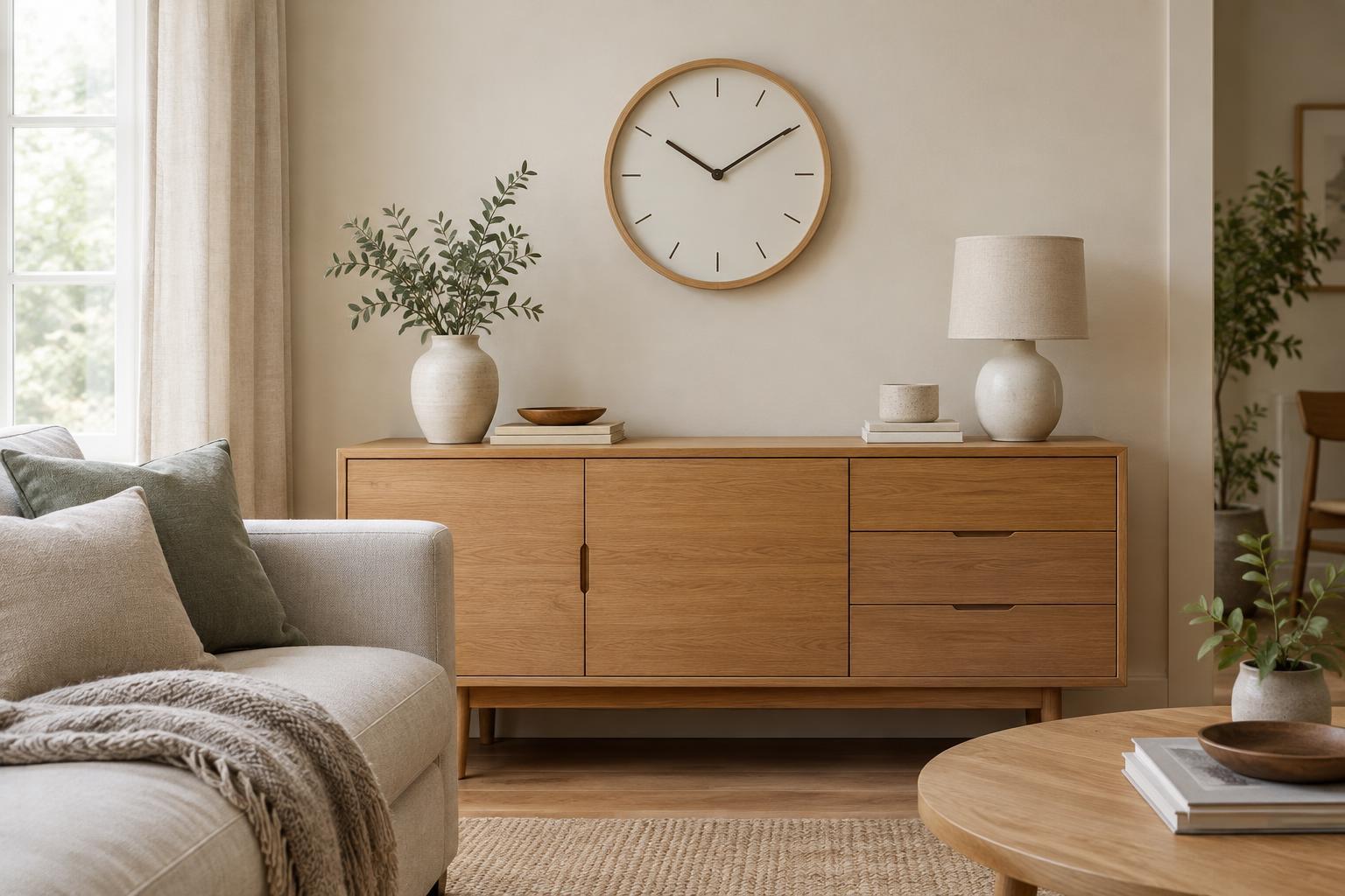
A clock can look attractive on its own yet feel lost on a broad wall. Equally, a large face may overwhelm a narrow strip of wall or a compact shelf. Look at the empty space from the spot where you normally stand or sit. If the clock will hang above a piece of furniture, consider the furniture and clock as one arrangement rather than judging the wall in isolation.
You can test the scale before committing. Cut a rough circle or rectangle from paper, or mark out the proposed size with removable tape, then step back. This makes it easier to judge whether the clock has enough presence without crowding nearby doors, artwork or lighting. For a shelf or mantel, leave space around a tabletop clock so its outline remains clear and it can be picked up when the battery needs changing.
Choose a face you can actually read
Contrast matters as much as size. Dark hands against a pale face, or pale hands against a dark one, are usually easier to distinguish than similar tones layered together. Decorative faces with little or no marking can be appealing, but consider whether you will find them convenient during a quick glance. If you are choosing a clock for someone else, simple hands and clear hour markers are often a safer choice than an intricate design.
Check how the face behaves in the room’s light. A glossy cover opposite a window or lamp may catch reflections at certain times of day. A deeply textured face can cast shadows that make slender hands harder to see. You do not need to avoid either feature entirely; just place readability alongside appearance when comparing options.
Connect the finish to the rest of the room
A clock does not have to match every accessory. It helps, however, to give it a visible connection to something already in the space. A timber frame might echo a side table; a painted rim could pick up a colour from a rug; a simple metal edge might relate to nearby lamp fittings. Repeating one detail is often enough to make the clock feel considered without making the room look overly coordinated.
If the room contains many patterns or small decorative objects, a plain clock face can provide a useful pause. In a restrained room, a distinctive shape or colour may give the clock more character. Avoid relying on a tiny product image to judge the finish: think about whether its texture and level of shine will sit comfortably beside the materials you already own.
Place it where it is useful and comfortable to see
Choose a position based on your natural sightlines. A kitchen clock might be most helpful when visible from the preparation area, while a living-room clock may work best where you can see it from a favourite seat. Before mounting one, hold it in place and check the view from several points. Watch for glare, awkward viewing angles and places where an open door could hide it.
For a wall clock, use fixings suitable for the wall and the clock’s weight, and make sure it sits securely. Keep it clear of spots where it could be knocked during everyday movement. Finally, leave access for setting the time and replacing the battery. A well-chosen clock should fit into the way you use the room, not require you to rearrange the room around it.