Start with what the room already tells you
An accent colour does not have to match your furniture exactly. Its job is to give the room a little energy while helping the pieces you already own feel connected. Before looking at paint charts or buying cushions, notice the colours that are hardest to change: your sofa, chairs, tables, rug and flooring. Also consider large surfaces such as curtains and walls. Together, these form the backdrop against which any new colour will be seen.
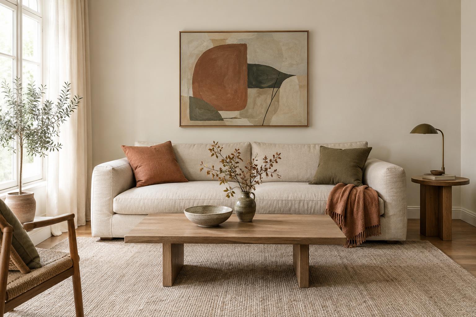
Take a quick inventory of the room. Is most of the furniture light or dark? Does it look warm, cool or fairly neutral? A cream sofa, oak table and woven rug create a different starting point from a charcoal sofa, black shelving and grey flooring. You do not need a perfectly coordinated room to begin. You simply need to know which existing colours the accent must sit beside.
Look at undertones, not just colour names
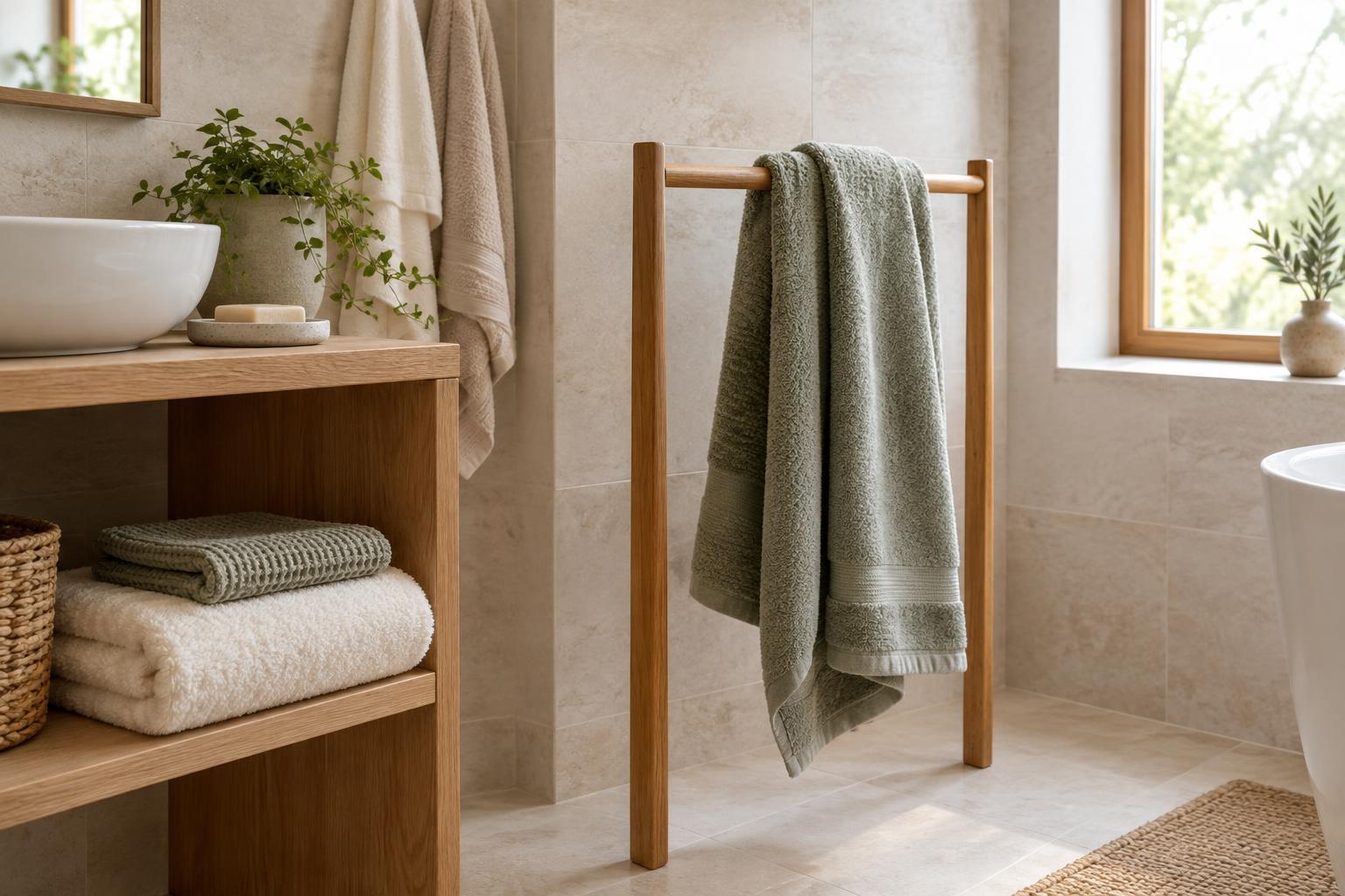
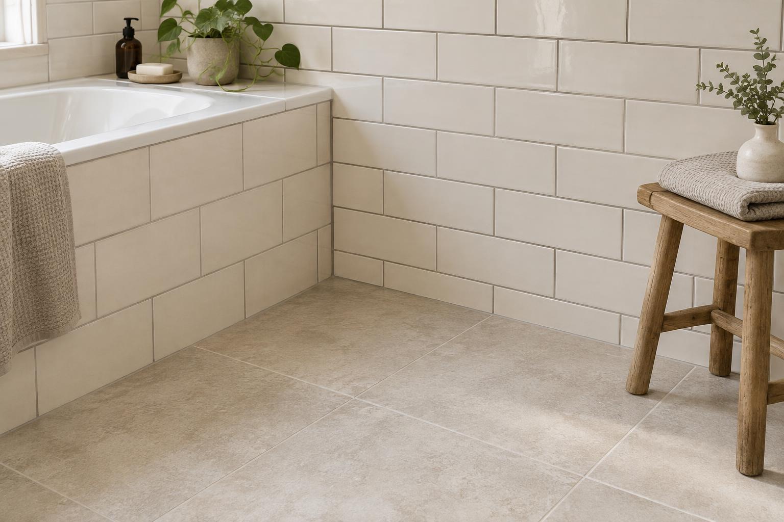
Two pieces described as beige can look surprisingly different together. One may lean yellow or peach, while another looks grey or slightly pink. Wood also varies: some finishes appear golden or reddish, while others look muted and grey-brown. These undertones affect how an accent colour reads, so judge your furniture by what you see rather than by its label.
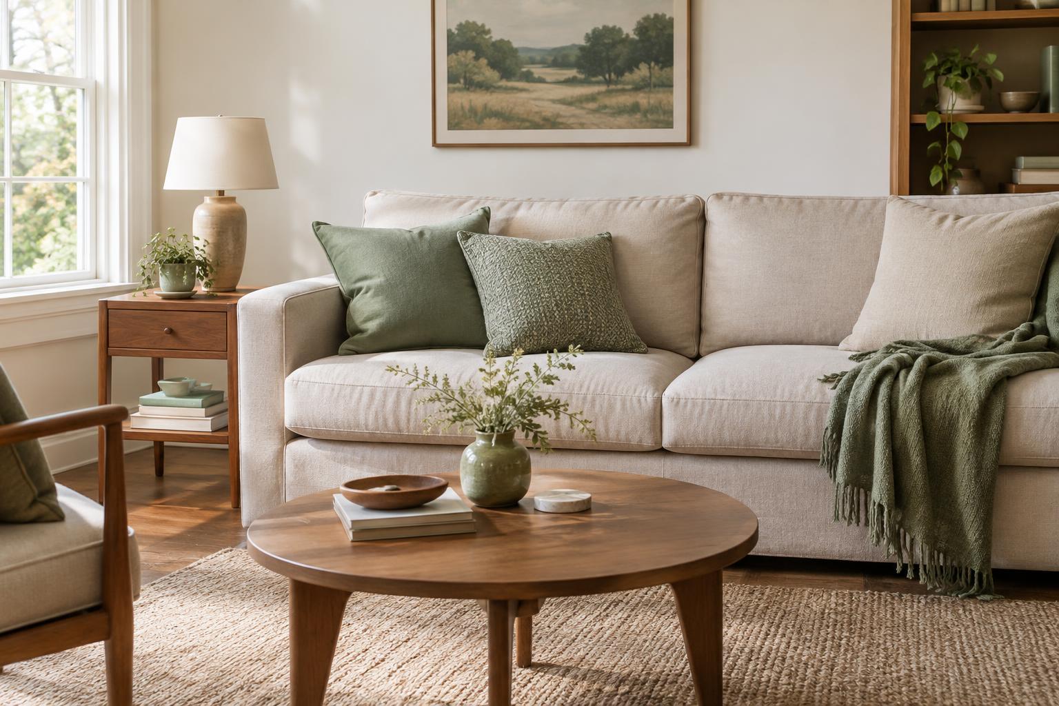
One approach is to echo an undertone already present. With warm oak and a cream sofa, muted terracotta, olive or ochre can create a gentle connection. With cooler grey upholstery and pale, grey-toned wood, dusty blue or a restrained green may feel more settled. Contrast can work too: a deep blue accent against warm wood, for example, can make both colours more noticeable. The aim is not to follow a rigid warm-or-cool rule, but to choose whether you want a quiet relationship or a more pronounced contrast.
If you are unsure about a fabric or wood finish, place a few colour samples beside it rather than relying on memory. You may find that a shade you loved on its own makes the upholstery look dull, while a less obvious choice brings out its best qualities.
Decide how much attention the accent should get
Think about the room’s mood before settling on a shade. A soft, muted accent tends to blend into an established scheme; a clear, saturated colour draws the eye. Both are useful, but they serve different purposes. If your furniture already has strong shapes, patterns or contrasting finishes, a quieter accent may give the room some breathing space. If the main pieces are simple and neutral, you may have more room for a bolder choice.
Choose one main accent to begin with, then vary its depth or texture rather than adding several unrelated colours at once. A sage cushion, a deeper green vase and a botanical detail in a print can feel connected without being identical. Natural materials, neutrals and the colours of your existing furniture can provide the supporting notes. This keeps the accent recognisable without making every object look as though it came from the same set.
Test the colour in the room itself
A colour that looks right on a screen or in a shop may behave differently at home. Daylight, lamps, wall colour and nearby furniture all change the way it appears. Bring a fabric swatch, paint sample or small object into the room and look at it beside your largest furniture piece. Move it to the places where you might actually use the colour: on the sofa, near a curtain or against a shelf.
Check it at more than one time of day if you can. Notice whether the shade becomes too bright, too muddy or almost invisible in the room’s usual light. If you are considering the accent for curtains or a large rug, test a sample of similar size and material when possible; a tiny colour chip cannot fully show how a broad area of fabric will feel. It is easier to reconsider a sample than to work around a purchase you do not enjoy.
Introduce it in a few deliberate places
Once you have chosen a colour, start with pieces that are easy to move or replace. A cushion, throw, lampshade, vase or framed print can show how the accent works without changing the whole room. Try placing it in two or three areas rather than concentrating everything on the sofa. A small repeat across the room helps the colour look intentional while allowing your furniture to remain the main feature.
Pay attention to material as well as colour. A rust-coloured linen cushion may feel relaxed beside a textured sofa, while the same shade in glossy ceramic adds a sharper note. If the room starts to feel busy, remove one accent item before changing the whole plan. You can always build up gradually. The most useful accent colour is not necessarily the most striking one: it is the shade that makes the furniture you own feel more considered and the room more comfortable to live in.