Start with the pattern you want to keep
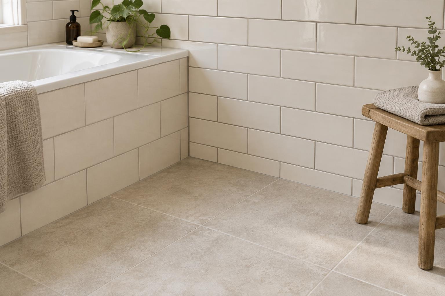
A patterned surface is easiest to work with when it has a clear role. It might be a tiled floor, floral wallpaper, a striped sofa or curtains you already own. Choose one as the starting point rather than trying to make every pattern equally prominent. Then look at it from across the room. Which colours remain noticeable at that distance? Those are usually more useful for choosing large solid areas than the tiny accents you can see only up close.
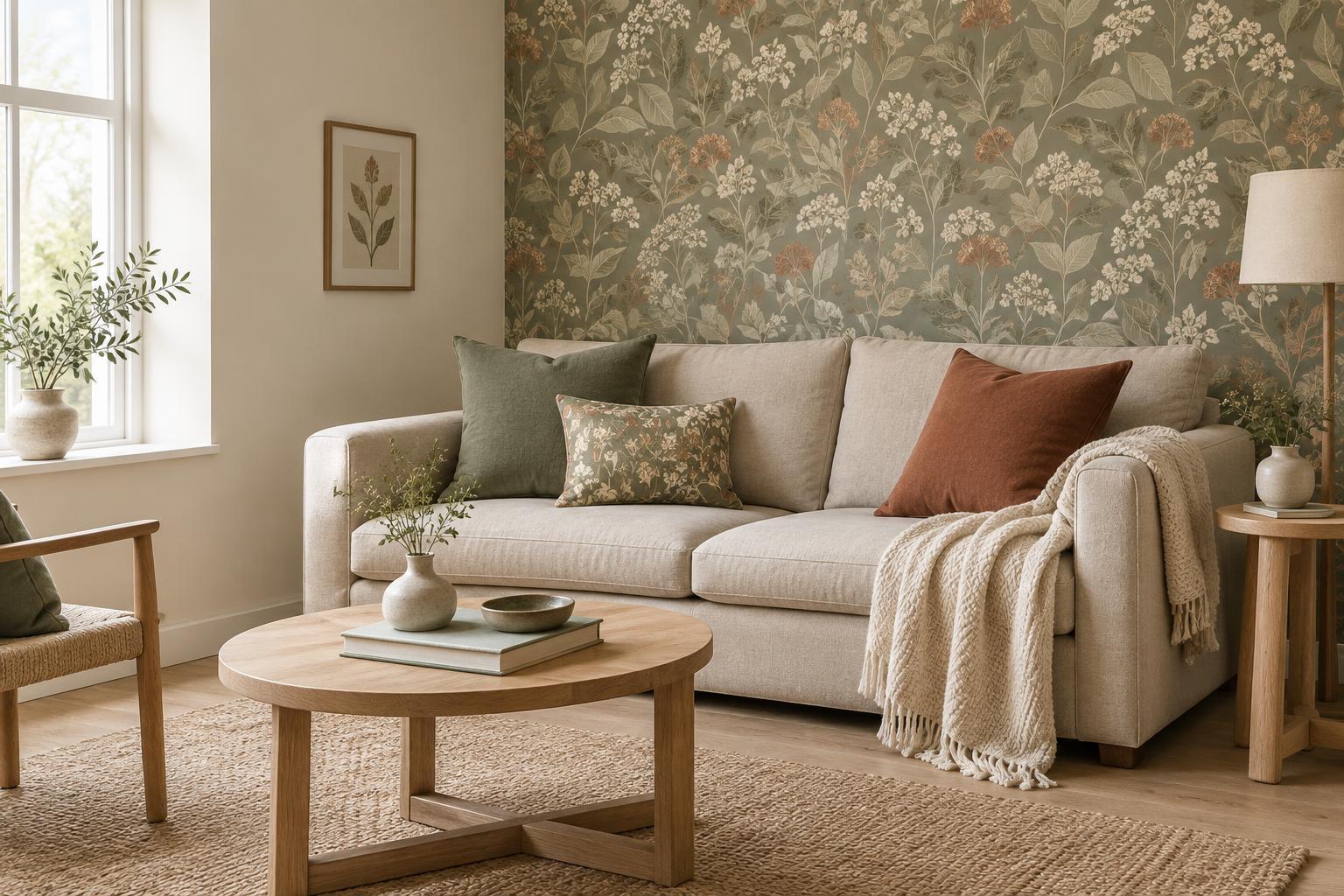
Notice the pattern’s background as well as its strongest colour. A wallpaper with dark green leaves on a warm cream ground may pair more comfortably with a warm cream wall or sofa than with a cool, bright white. You do not need an exact match: a solid colour that shares the pattern’s general warmth or coolness often looks more natural than one chosen from a screen or a paint name alone.
Give the eye a place to rest
Pattern draws attention because it changes repeatedly across a surface. Solid colours provide a pause. If the pattern covers a large area, such as a floor or all four walls, keep nearby furniture, window treatments or bedding relatively quiet. If the pattern appears only on a small chair or cushion, there is more room for colour elsewhere. The aim is not to remove interest, but to make it easy to see what matters most.
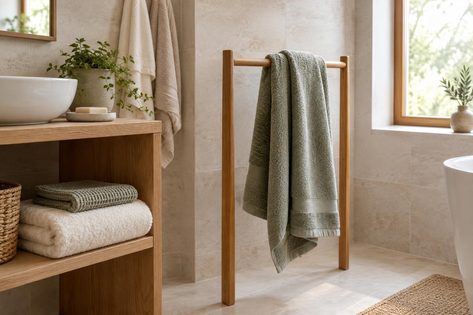
Think about what sits directly beside the pattern. Plain curtains can frame patterned wallpaper; a solid rug can soften a patterned floor where practical; simple bedding can make a patterned headboard feel intentional. The solid area does not have to be pale or neutral. Deep blue, terracotta or olive can act as a calm backdrop when used consistently and without additional motifs.
Build a small palette from light to dark
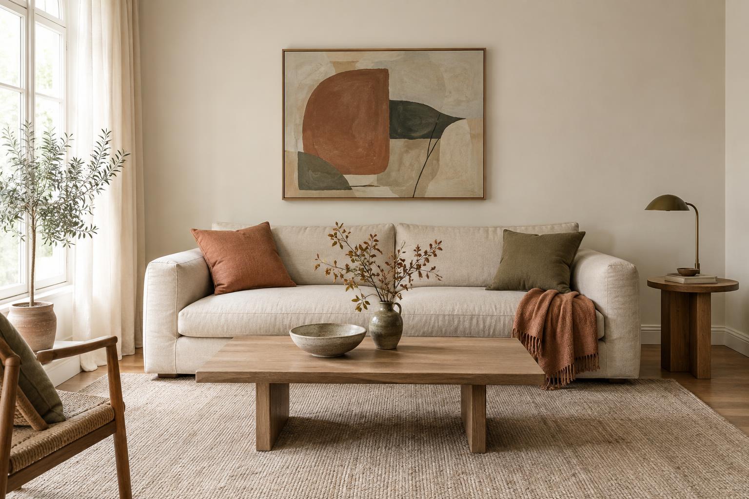
Try selecting two or three solids with different jobs. One can be a quiet base for the largest remaining surfaces, another can connect to a recognisable colour in the pattern, and a third can add depth in smaller pieces. For example, a tile with cream, rust and charcoal could sit alongside cream walls, rust cushions and a few charcoal details. Repeating colours in different amounts ties the room together without making every item match.
Pay attention to contrast. A dark, detailed pattern next to an equally dark solid can look rich, but its outline may become less distinct. A lighter solid gives it more definition. Neither effect is automatically better; decide whether you want the patterned surface to stand out or blend into the room. Testing a few large colour samples beside it will tell you more than comparing small swatches held in your hand.
Use texture to keep solids interesting
A solid-coloured item can still have character. Linen curtains, a matte painted wall, a woven rug and smooth ceramic objects each reflect light differently, even when their colours are similar. Combining textures helps a room feel layered while leaving the pattern as the main visual detail. This is especially useful when a bold wallpaper or tile already supplies plenty of movement.
Materials also affect how a colour appears. A velvet cushion may look deeper than a cotton one in a similar shade; a glossy tile may seem brighter than a matte sample. Check combinations in the room where they will be used, near both natural and artificial light. If a solid feels too flat, try changing its texture before adding another colour or pattern.
Test the combination in the room
Before buying several new pieces, bring together samples of the pattern and your proposed solids. Place them where the finished materials will meet: a paint sample beside the wallpaper, a fabric sample against the sofa, or a rug sample on the floor. Step back and look at the group at different times of day. A combination that feels balanced on a table may look different when one colour covers an entire wall.
Make changes one at a time. If the room feels busy, simplify the solid colours first and reduce small decorative accents. If it feels disconnected, repeat one colour from the patterned surface in two or three modest places, such as a throw, lampshade or vase. Starting with pieces you can move or replace lets you adjust the balance without changing the patterned surface that drew you to the room in the first place.