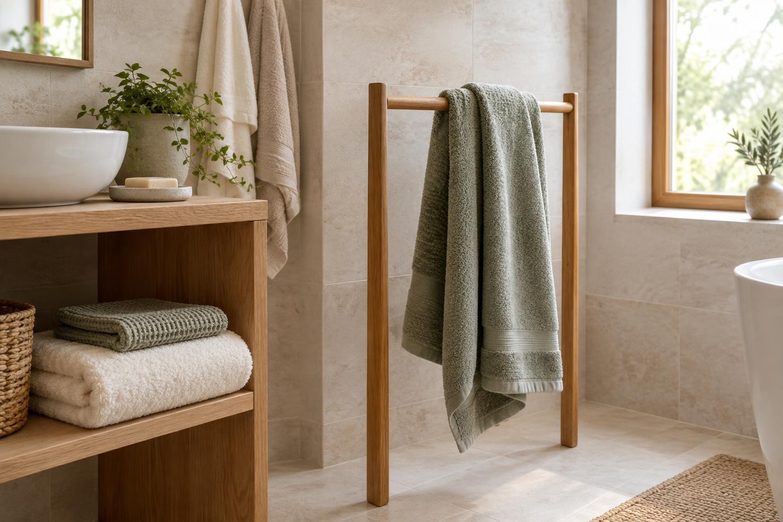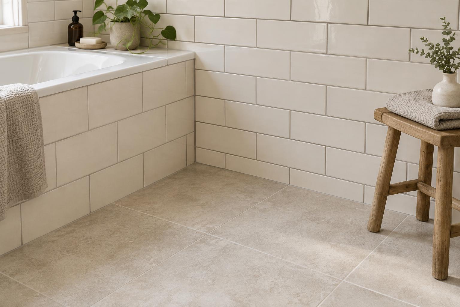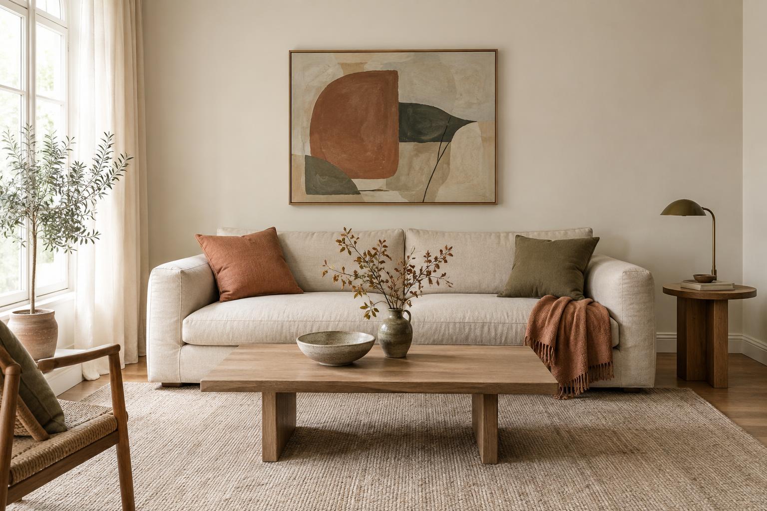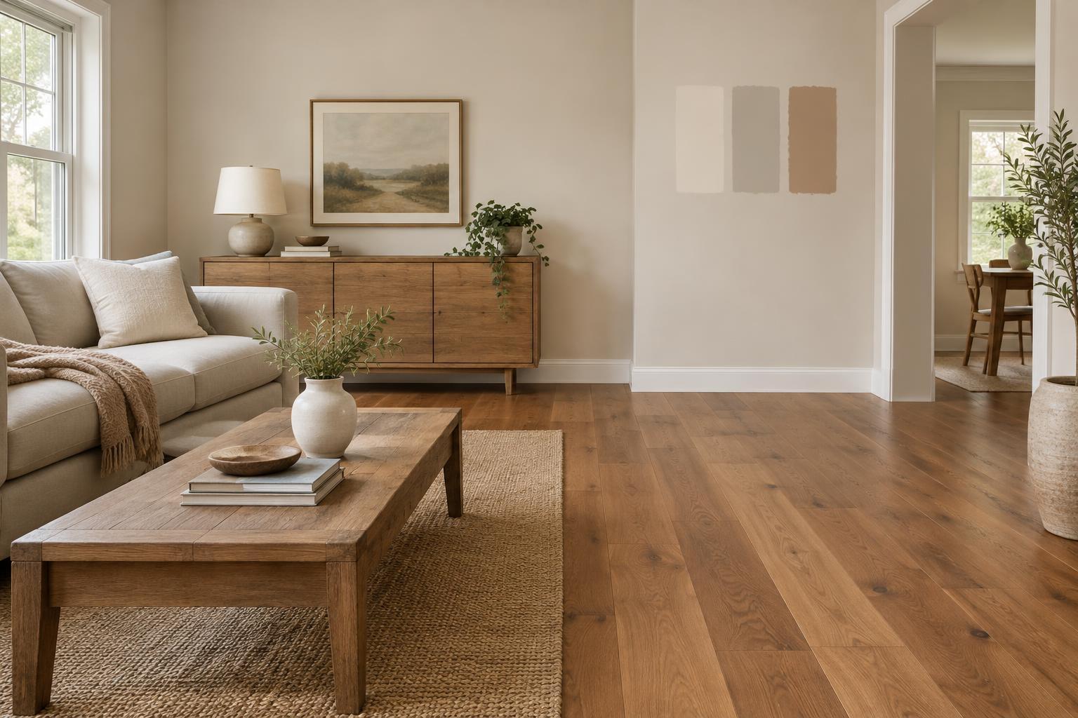
Start with the floor you actually have
Flooring takes up a large part of what you see in a room, even when much of it is covered by furniture. Before looking at paint charts, study the floor in daylight and with the lights you normally use at night. Note whether its overall impression is light, medium or dark, and whether its colour looks warm, cool or fairly neutral. Look at several areas rather than one plank or tile: natural variation, grout and the direction of the light can change what stands out.
Then decide what you want the relationship between the floor and walls to be. Similar tones can make the room feel calm and continuous, while a stronger contrast can give the floor more definition. Neither approach requires an exact colour match. The aim is to choose wall colour deliberately, rather than treating the floor as a neutral background when it has a visible character of its own.
Read the undertones without chasing a perfect match
Many floors contain more than one colour. Oak might show honey, beige and grey in the same board; stone-look tile may combine cream with cooler veining. Instead of trying to match every shade, identify the colour that gives the floor its overall warmth or coolness. Warm floors often sit comfortably beside soft creams, muted greens and warm off-whites. Cooler grey floors may work with blue-grey, gentle green or a neutral white that does not turn noticeably yellow beside them.
These are starting points, not rules. A warm floor and cool wall can look considered when another element, such as a rug, artwork or upholstery, connects them. Be especially careful with colours that seem nearly identical but have conflicting undertones: a pink-leaning beige wall, for example, may make a yellow-leaning floor look more yellow. If two close colours seem to compete, try a clearer contrast or a quieter neutral instead.
Balance colour with value and room light
Undertone is only part of the choice. Value—how light or dark a colour appears—shapes the balance of the room. With dark timber or charcoal tile, pale walls can create a clear, airy contrast, while deeper walls can make the room feel more enveloping. Light floors give you room to use stronger wall colours without necessarily making the whole space look dark. Consider the size and colour of major furniture too: a large pale sofa or dark cabinet changes the balance between floor and walls.
Check how much natural light the room receives and where it falls. A colour that looks soft beside a sunny window may feel flatter in a shaded corner. Lamps can also make paint appear warmer or cooler in the evening. Rather than choosing a wall colour solely to make a room look brighter, test whether you enjoy it at the times you actually use the space.
Adjust your approach for wood, tile and carpet
Wood flooring usually brings visible grain and variation, so a relatively simple wall colour can let that texture lead. If the timber has a strong orange or red cast, you do not have to repeat it on the walls. A restrained neutral or muted colour may give it space without creating a room full of the same warm tone. For pale or grey-washed wood, look closely at whether it reads more beige or blue-grey before choosing an off-white.
Tile adds grout, pattern and sometimes a reflective finish to the equation. View paint samples beside both the tile and grout, particularly if they contrast. With carpet, consider the colour across a broad area rather than a single fibre; pile direction and shadows can affect its appearance. If a floor has a bold pattern or pronounced colour, keeping the walls simpler is often an easy way to give the room a clear focal point.
Test a small shortlist in the finished room
Narrow your options to a few colours, then place generous painted samples or sample boards where you can see them next to the floor. Move boards around the room and check them in morning, afternoon and evening light. View them from standing height as well as close up. A tiny paint chip can hide an undertone that becomes obvious across a wall.
Before deciding, look at the samples alongside fixed features such as skirting boards, doors, countertops or a fireplace. Also consider views into adjoining rooms: colours need not match from room to room, but the transition should feel intentional. If the floor still seems difficult to coordinate, a wall colour that is quieter than the flooring is a practical fallback. You can bring in more adventurous colour through cushions, curtains and objects that are easier to change.