Start with the wood you cannot easily change
A room rarely begins with a blank slate. Flooring, doors, built-in shelves or a large dining table may already establish a strong wood tone. Treat the most prominent of these as your starting point, not as a finish that every new piece must copy. Trying to match it exactly can be frustrating: two woods that look identical in a shop may appear noticeably different once they sit side by side at home.
Notice how much of the existing wood you see. A timber floor covers a large area but is often partly hidden by rugs and furniture. A tall cabinet may occupy less space yet draw more attention because it sits at eye level. Choose one or two pieces to play a leading role, then let smaller wooden items add variation without competing for it.
Look at undertones before lightness
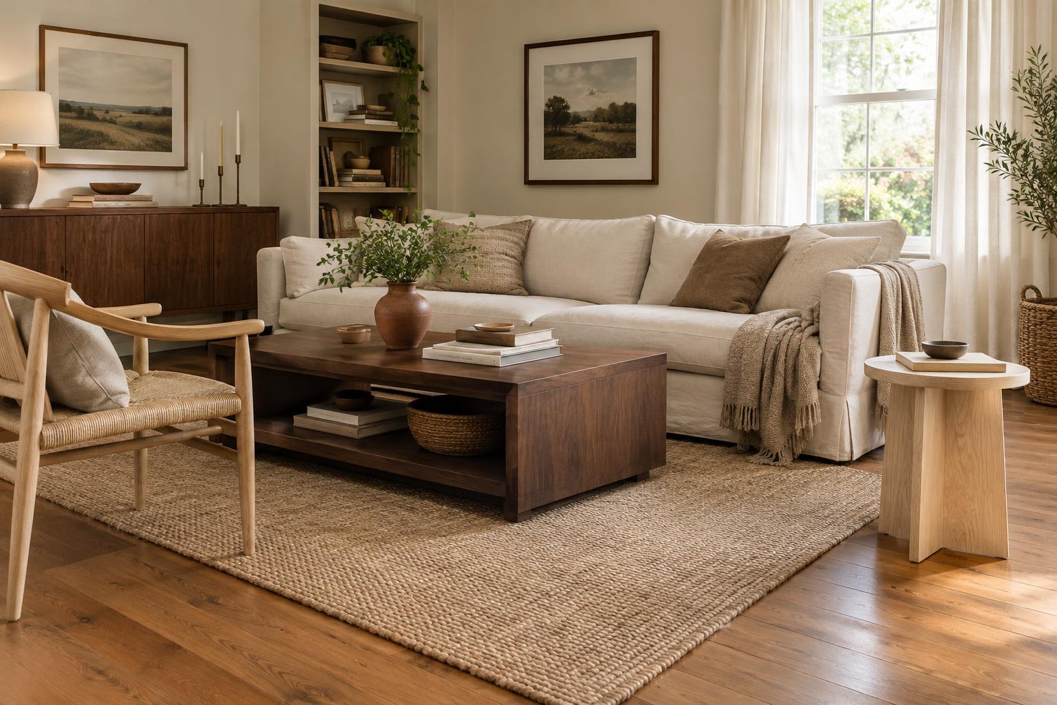
Wood tones vary in more than how light or dark they are. Some lean golden or reddish, while others appear grey, brown or nearly neutral. Woods with similar undertones often sit comfortably together even when one is pale and the other is deep. For example, a light golden table can work with a darker, warm brown cabinet because both have a sense of warmth.
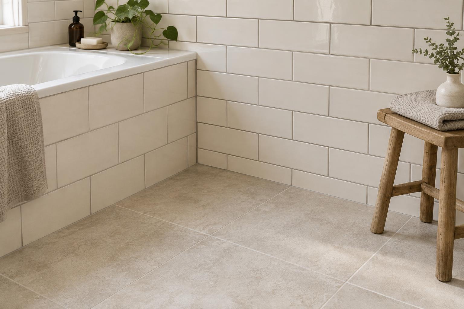
You do not need to exclude every contrasting undertone. Instead, be deliberate when adding one. If a room is full of warm wood, a single cool, greyed piece may look accidental; repeating that cooler note in a frame or small stool can make it feel considered. Check samples in the room at different times of day, as daylight, lamps and nearby wall colours can change how a finish appears.
Use contrast instead of almost-matches
Pieces in nearly the same colour can look mismatched when their grains and undertones differ. Clear contrast is often easier to read. A pale oak-style side table next to a dark brown sofa frame looks like a choice, while two medium-brown finishes that are just slightly different may seem as though they were meant to match but missed. Give contrasting pieces a little visual space rather than crowding them together.
Contrast can come from grain as well as colour. If a large piece has a lively, visible grain, consider pairing it with a quieter wood finish rather than introducing several equally busy patterns. Painted furniture, upholstery or a rug can also provide a pause between wooden surfaces. The aim is not to hide the differences, but to give the eye a comfortable route between them.
Repeat tones and connect them with other materials
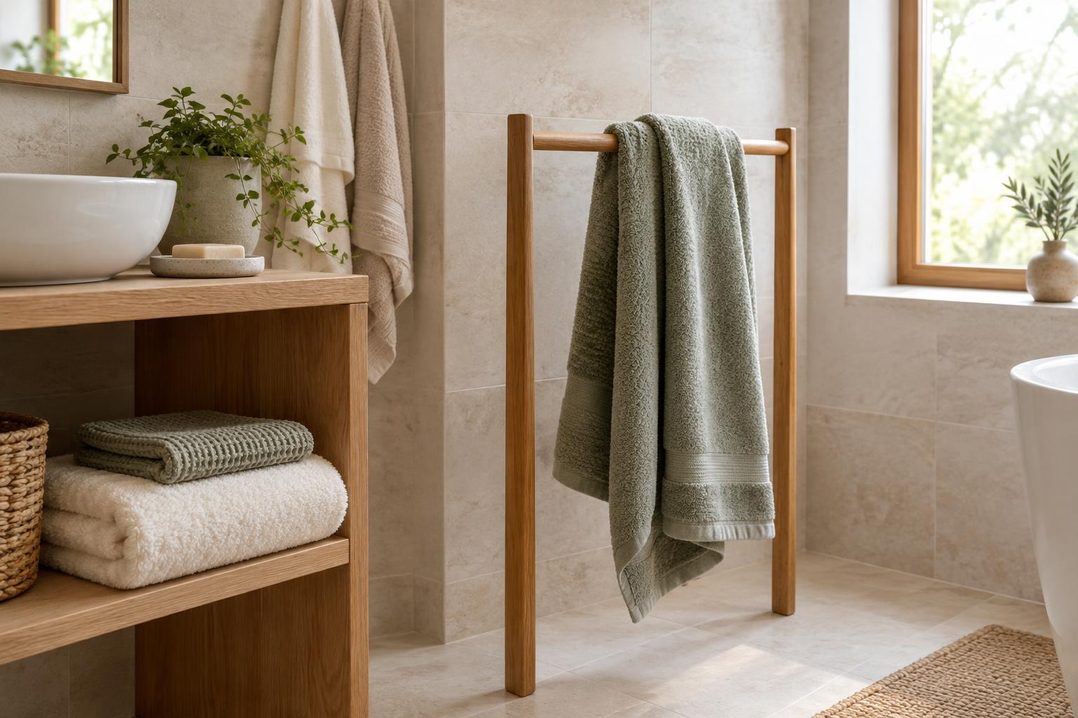
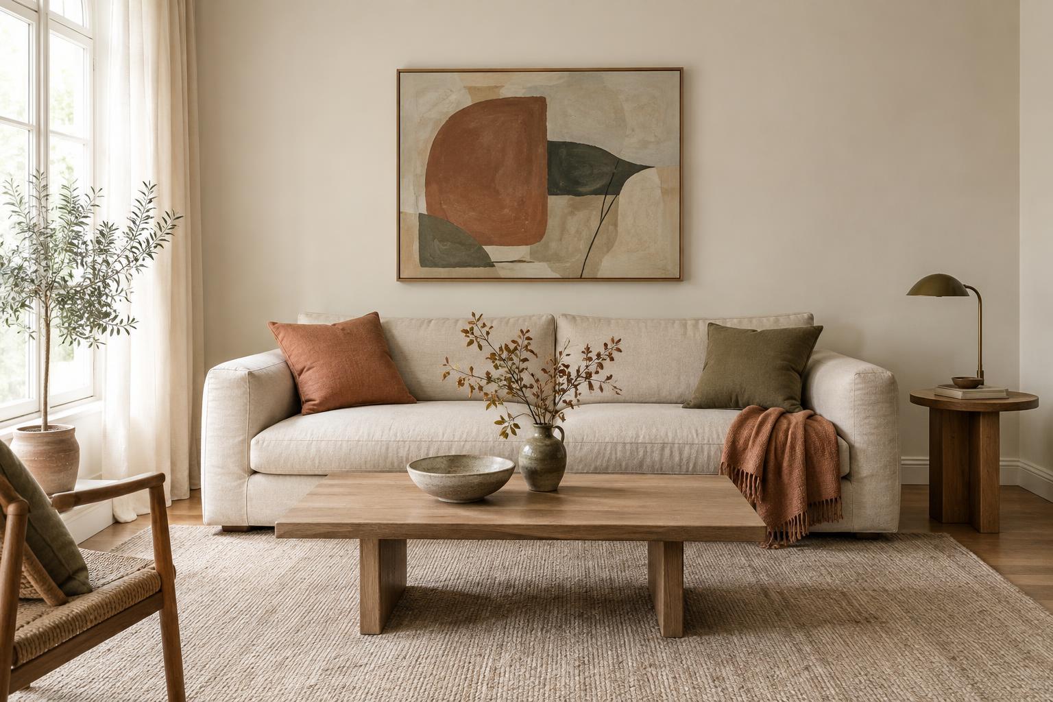
A useful way to make mixed woods feel intentional is to echo each noticeable tone at least once. A dark coffee table might connect to a dark picture frame or lamp base; a light wooden chair might relate to a small tray or shelf. The repeats do not need to be identical. They simply help each finish feel like part of the room rather than an isolated purchase.
Textiles are especially helpful when the wood tones are far apart. A rug with warm beige, deep brown or soft grey can pick up colours already present in the furniture. Cushions and curtains can perform the same quiet linking role without adding another hard surface. Keep those connecting colours fairly restrained if the room already contains several distinct wood grains.
Edit the mix in the room, not in isolation
Before buying a major piece, bring a finish sample home if possible, or compare it with clear photos of the existing furniture in the same light. Look beyond the wood itself: a table with slender legs may feel lighter than a chunky one in a similar finish. Scale, shape and placement affect how strongly each tone registers, so a balanced room does not require equal amounts of every wood.
If the mix still feels unsettled, avoid replacing everything at once. First try moving two similar tones farther apart, adding a rug beneath a prominent piece, or removing one small wooden accessory. These changes can reveal whether the issue is the finish or simply too many competing details. A cohesive room can contain several kinds of wood; it needs enough repetition and breathing room for each one to belong.