Why whites look different beside each other
A white paint rarely looks exactly like the small chip in your hand. Next to another white, it may appear yellow, pink, green, blue or grey. That subtle colour impression is its undertone. You may not notice it when looking at one sample alone, but it can become obvious beside a different paint or a fixed feature such as a door, tile or countertop.
Start by deciding what you want the white to do. A crisp white can make trim look distinct against coloured walls. A softer off-white may feel more comfortable across a large room. Neither choice is automatically warmer or more welcoming: the result depends on the light and on the colours already in the space. Treat names such as “ivory” or “snow” as labels, not reliable descriptions of how a paint will look at home.
Compare samples to reveal their undertones
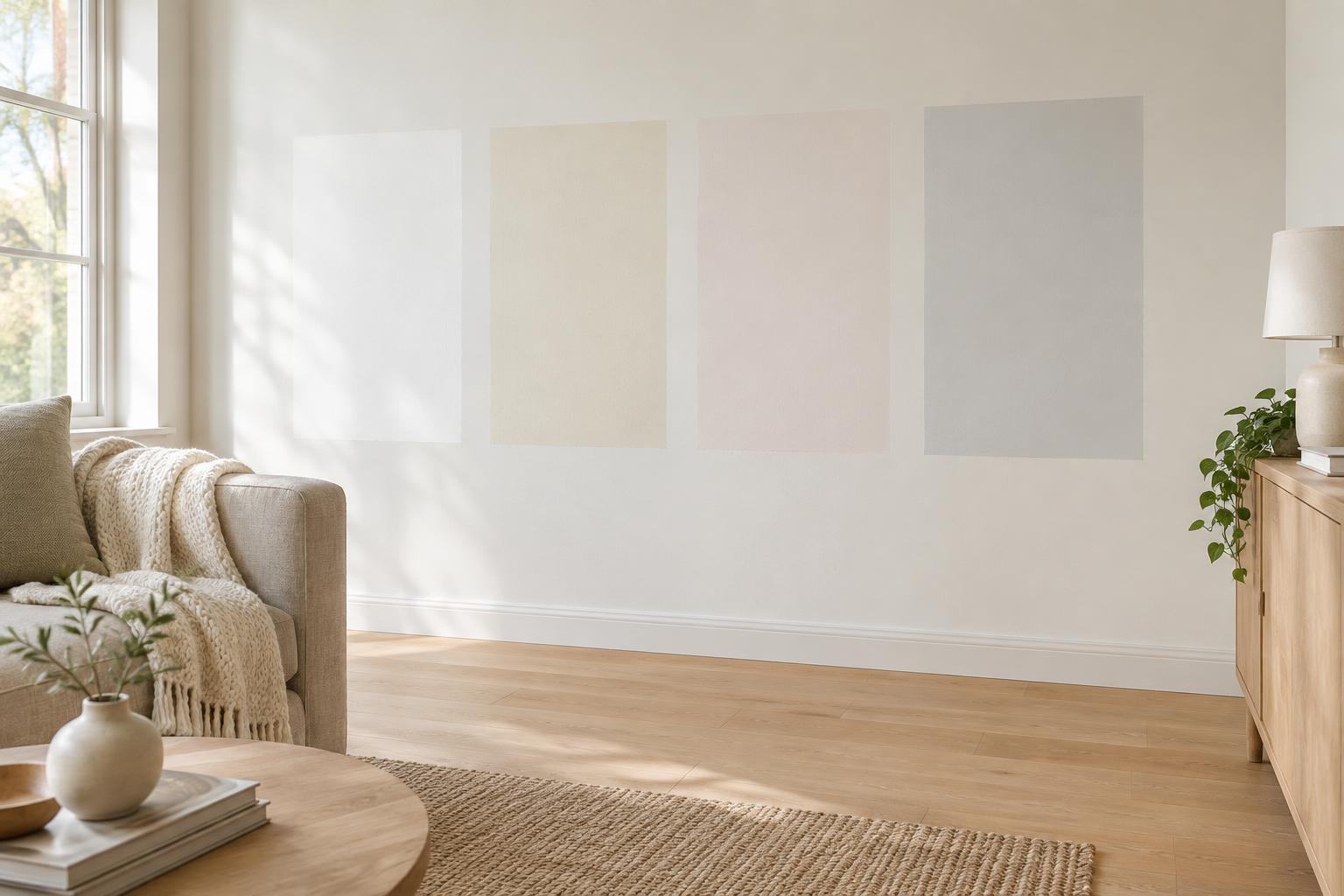
Gather a small group of likely whites rather than a large collection of near-identical chips. Place them side by side on a plain, neutral background. A white sheet of paper can be a useful starting point, although paper itself varies in colour. Comparing the paints with one another is often more revealing: one may look distinctly creamier, while another looks cooler or slightly pink.
Then move the samples beside the surfaces that will remain in the room. Hold them near the flooring, cabinetry, stone, tile and trim, as well as any large sofa or curtains. Ask what each comparison brings out. A white that looks neutral on a sample board might appear yellow beside a cooler countertop. A grey-leaning white might look dull beside warm wood. These observations are more useful than trying to identify an undertone in isolation.
If you plan to paint both walls and trim, compare those choices together. Two whites with different undertones can make one look unexpectedly dirty or tinted. Using the same colour on both, with different finishes if desired, is one way to create a quieter transition.
Test the paint in the room, not just in the shop
Light changes how a white appears. A bright window, a shaded corner and an evening lamp can each bring out different qualities in the same paint. Check samples at several times during the day and under the lighting you normally use. Notice not only whether you like the colour in the brightest spot, but also whether it still feels right where the walls receive less light.
Paint a generous sample on a movable board, or use an appropriate large sample sheet. Give the coating enough coverage for the colour to look even, following the paint maker’s directions. Move the sample around the room and hold it vertically against different walls. This helps you see the paint in context without committing to patches across the room. If you do paint directly on a wall, view the patch against its surroundings with care: a strong existing wall colour can distort your impression.
Keep your shortlist narrow during this stage. If two options are difficult to distinguish in your room, consider their relationship with the permanent finishes and the effect you want overall rather than searching for a supposedly perfect white.
Choose a white that supports your materials
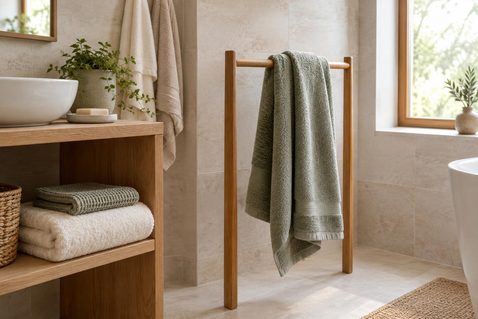
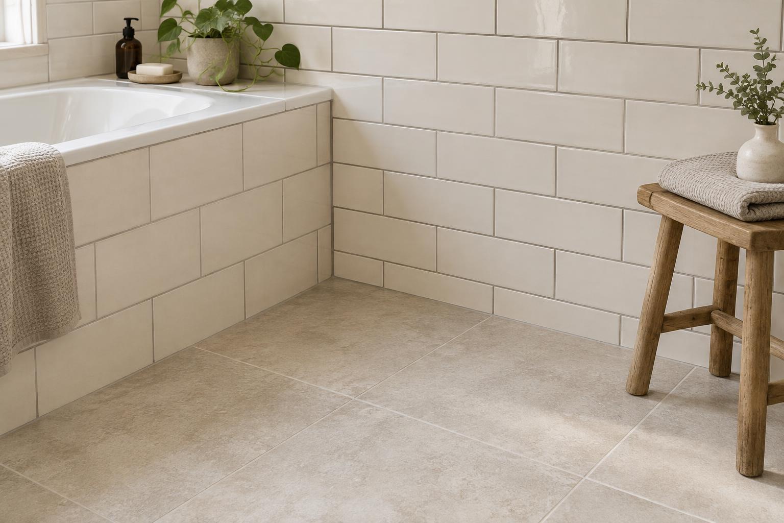
Look first at the elements that are hardest to change. Warm timber, cream tile or beige stone may sit comfortably with some soft whites, while a sharp white can create a noticeable contrast. Cooler flooring or grey cabinetry may make a creamy paint appear more yellow. These are tendencies, not rules: contrast can be attractive when it is deliberate.
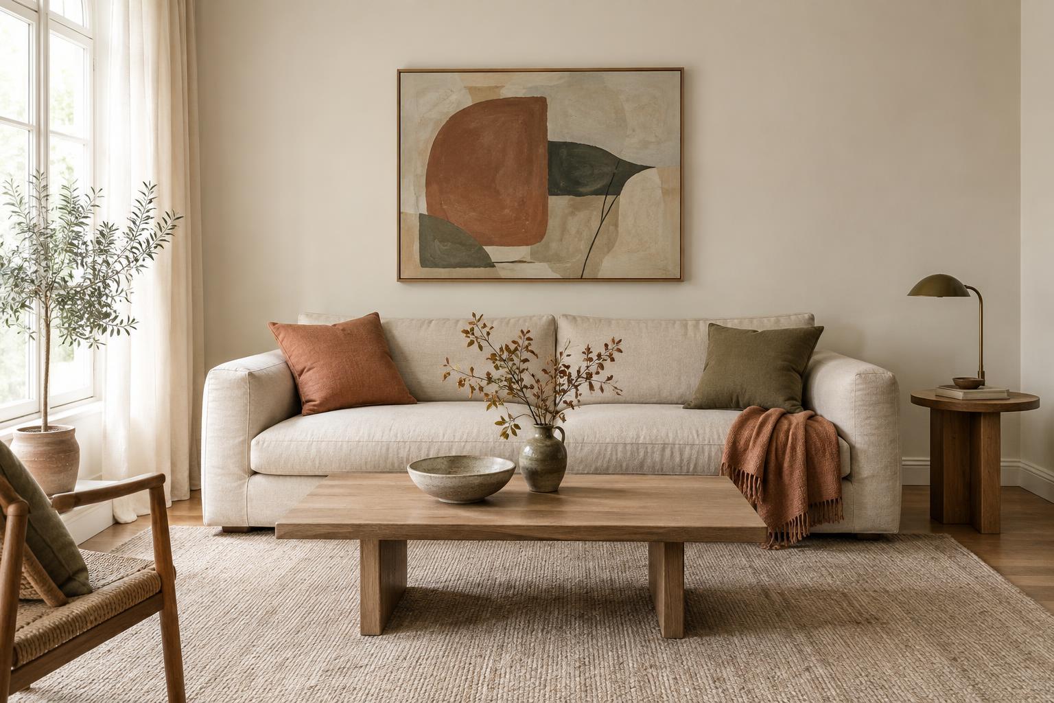
Textiles offer another clue. Put a curtain or cushion fabric against your shortlisted samples, especially if it covers a large area or contains a pale background. If the fabric suddenly looks dingy, or the paint looks oddly tinted, try a different pairing. You do not need every pale surface to match. Aim for a combination in which the differences look intentional, with enough contrast to keep features distinct or enough similarity to make them feel connected.
Finally, consider the room as a whole rather than choosing paint solely to match one object. The best option is often the white that works reasonably well with several important features and remains pleasant in the light you live with every day.
Make the final choice with confidence
Before buying paint for the whole room, check the sample beside adjacent spaces and any doors or trim that will stay as they are. A white viewed through a doorway can look different when it sits next to another wall colour. Also decide where a clear change of colour will occur; an intentional boundary is usually easier to understand visually than two almost-matching whites meeting without a plan.
Undertones are not a test you have to pass by naming every hint of colour. They are a way to notice relationships. Compare a few candidates, view them at a useful size in your own light, and judge them beside the materials you intend to keep. That simple process gives you a more dependable choice than selecting a white from its name or a tiny chip alone.