Choose what catches the eye first
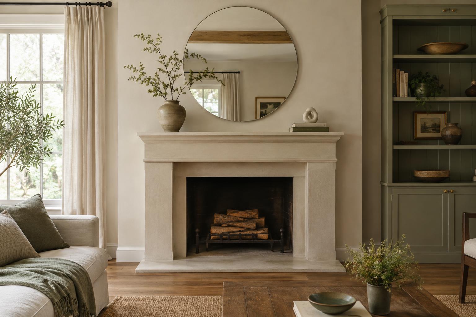
A successful mantel display gives the eye somewhere to land before it moves to smaller details. That first stop might be a piece of art, a mirror, a sculptural vase or an arrangement of branches. Choose one main feature rather than asking several large objects to compete. The focal point does not have to sit exactly in the centre, but it should feel deliberate in relation to the fireplace and the furniture around it.
Before choosing an object, step back and look at the whole wall. A narrow mantel under a tall chimney breast may suit a vertical artwork, while a wide mantel can support a broader piece. Think about contrast, too: a dark frame against a pale wall will draw attention more quickly than a frame that blends in. If you already have a favourite piece, let its size, colour or shape guide the rest of the display.
Build a supporting arrangement
Once the focal point is in place, add a small number of supporting pieces. Try placing a taller object to one side and a lower group on the other. This creates balance without making both sides identical. A vase and a short stack of books, for example, can carry different visual weights while still feeling connected. Look at the outline of the arrangement: varied heights usually make it more engaging than a row of objects that all end at the same level.
Keep supporting pieces visibly secondary. If everything is bold, oversized or equally colourful, the focal point loses its role. Repeat one detail, such as a warm wood tone or a curved shape, to make separate objects feel related. Then leave some mantel surface uncovered. Empty space is part of the composition; it helps distinguish the objects you chose instead of making them read as one crowded collection.
Use layers without losing clarity
Layering can give a mantel depth, especially when a framed piece leans behind a smaller object. Overlap sparingly so the main artwork or mirror remains easy to see. A branch in a vase might cross one edge of a frame, but it need not cover its most interesting area. If several objects are leaning, check that each is stable and that the display does not look as though it is waiting to be put away.
Vary texture as well as height. Matte ceramic, glass, wood and metal can sit comfortably together when their colours have something in common. You might use a quiet palette of cream, brown and black, then let a single glazed vessel provide a brighter accent. There is no need to match every finish in the room. A few repeated tones or materials are usually enough to connect the mantel to nearby cushions, furniture or lighting.
Check the view from the room
A mantel is rarely seen only from straight ahead. View it from the doorway, the sofa and any other place where you spend time. An arrangement that seems balanced close up may look lopsided across the room, or a small focal point may disappear against a large wall. Adjust one object at a time, then step back again. Taking a simple photograph can also make crowded areas and awkward gaps easier to notice.
Pay attention to the fireplace itself. If it is used, follow its manufacturer’s guidance on clearances and keep flammable or heat-sensitive decorations away from heat and flames. Secure heavy pieces appropriately rather than relying on a precarious lean. These practical limits can help refine the display: a clear, uncluttered area around the fireplace often makes the mantel feel calmer as well.
Edit before adding anything new
If the display still feels busy, remove an item before buying another. Ask whether each piece strengthens the focal point, adds useful variation or simply fills a gap. Small objects often work better as a group than scattered individually across the entire mantel. Keep a little breathing room between that group and the main feature so their roles remain clear.
For a seasonal refresh, retain the focal point and change just one or two supporting details. A different branch, a new vase colour or a small object brought in from another room can shift the mood without requiring a complete redesign. The aim is not perfect symmetry or a fixed formula. It is a display that draws attention to something you enjoy and gives the surrounding details room to support it.