Start with the room, not the paint card
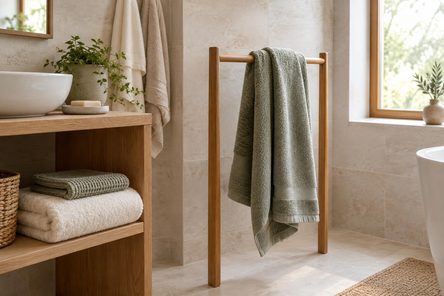
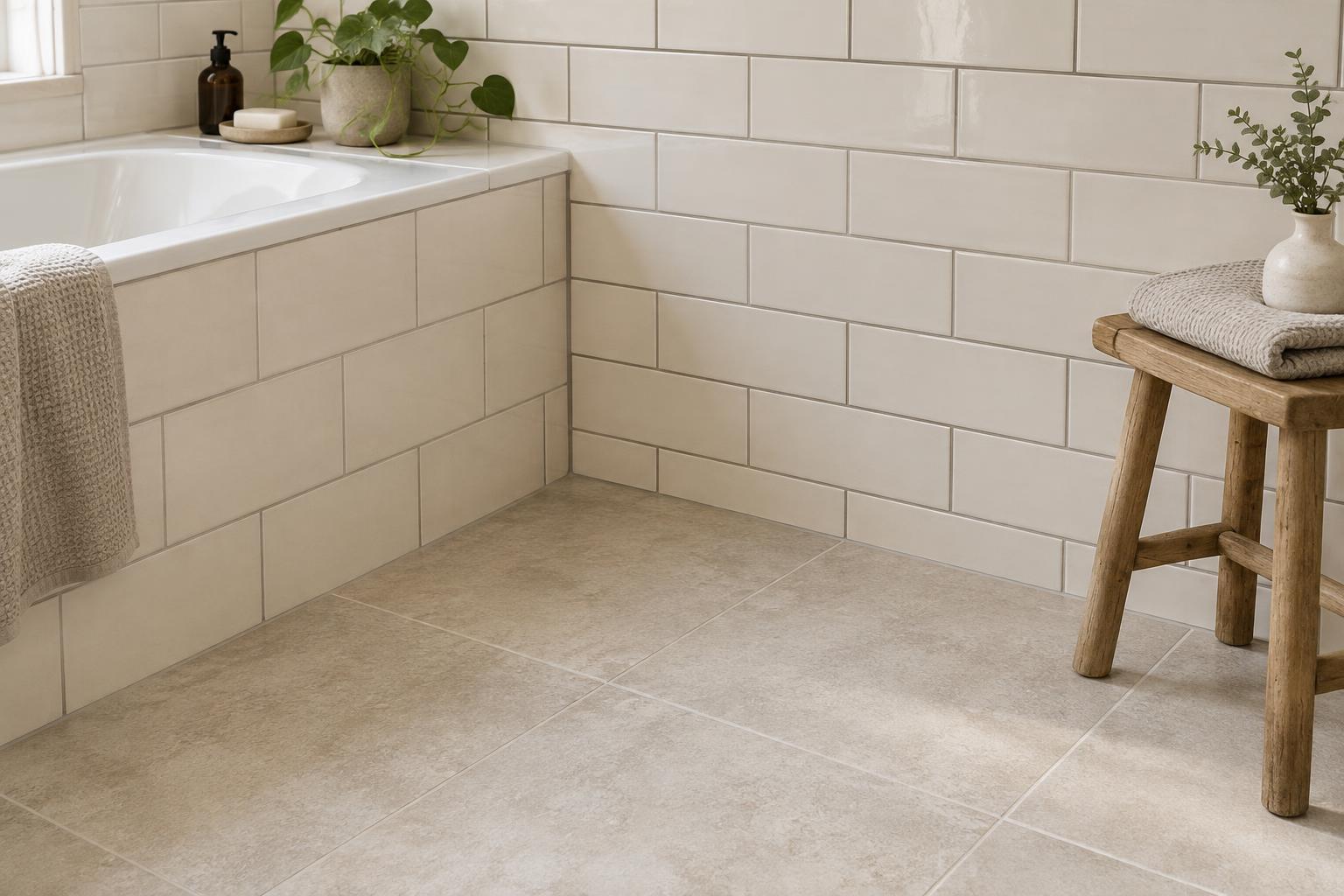
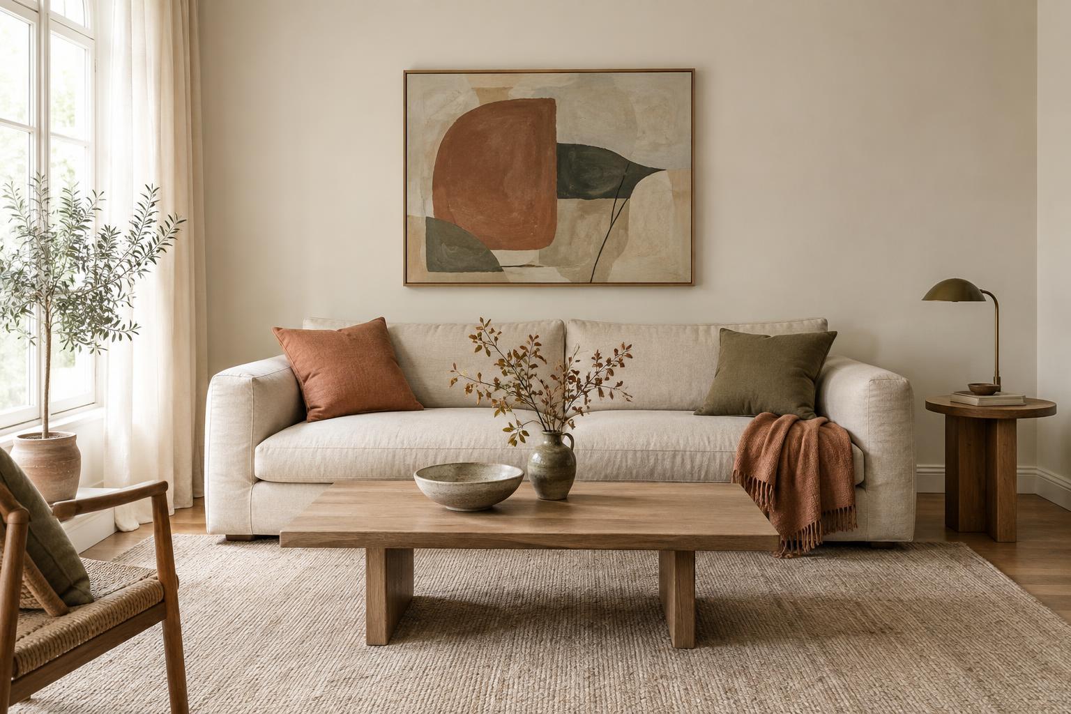
A paint card is useful for narrowing your options, but it cannot show exactly how a colour will look across a wall. The size of the painted area, the light entering the room and the colours nearby all affect what you see. A soft white beside warm wood may appear different from the same white beside a cool grey floor. Before choosing a shade, identify the surfaces and objects that will remain in the room.
Decide what you want the paint to do. Should it make the walls feel quiet behind colourful furnishings, bring out a material such as timber, or create a stronger contrast with the trim? Keep that goal in mind as you select two or three samples. Testing a small group is easier than comparing many similar shades at once.
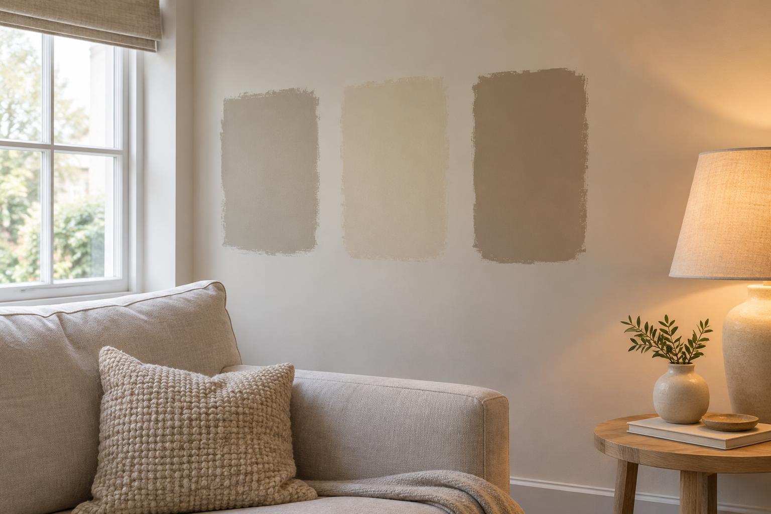
Make samples large enough to judge
Small swatches make subtle differences hard to see. Paint generous test patches on more than one wall, or coat movable sample boards if you would rather not mark the walls yet. Apply the paint as directed and allow it to dry before judging the colour. If the final finish will be matte, eggshell or another sheen, test in that finish where possible: sheen can change how light reflects from the surface.
Place samples where they will be seen in daily life, such as behind a sofa or next to a doorway. Avoid putting competing colours directly against one another for every comparison; their contrast can exaggerate differences. Leave some space between patches or look at each board separately. A movable board helps you compare positions, while a patch on the wall shows how the colour behaves on the actual surface.
Check daylight at the times you use the room
Daylight changes in strength and character as the day passes. A wall that receives direct sun for a short period may look brighter than a wall that stays in shade, even in the same room. Look at each sample in morning, midday and late-afternoon light when those times are relevant to how you use the space. Check both the wall nearest the window and a darker corner.
Do not judge only when the room looks its brightest. A colour that seems pleasantly muted in strong daylight might feel dull when the light fades; a pale shade may look sharper than expected on a sunlit wall. Notice whether the colour still supports the mood you want across the room’s ordinary light conditions. If you use window coverings regularly, view the samples with them in their usual positions too.
Repeat the test with the lights you actually use
After dark, turn on the room’s normal lamps and ceiling lights. Different bulbs and fixtures can make the same wall appear warmer, cooler, brighter or flatter. Test under the lighting arrangement you expect to keep, rather than a temporary work light. If you normally use table lamps instead of the ceiling fixture, those lamps deserve the most attention.
Look at how the sample relates to nearby materials under artificial light. A beige that works well with a rug by day may seem too yellow beside it at night; a blue-grey may feel cooler than intended. Before rejecting the paint, check whether one particular lamp is causing the change. You may prefer to adjust the lighting, but make that decision separately from choosing the wall colour.
Choose for the whole room, not one perfect moment
Take brief notes as you test: which colour looks best beside the floor, which feels comfortable in the evening and whether any shade becomes too bright or too subdued. You do not need a colour that looks identical in every condition. The useful choice is the one whose changes you can live with and whose undertone works alongside the room’s fixed finishes.
When two shades are close, move the samples next to the largest elements you are keeping, such as curtains, upholstery or cabinetry. Step back to view the room as a whole, then check the samples again from the doorway. If neither feels right, try a new shade rather than settling because you have already bought samples. A little time spent observing the paint can save a much larger repaint later.