Start with the feeling, not a colour formula
Contrast helps a room feel defined. A dark table against a pale rug is easier to notice than one surrounded by similar tones; a light sofa can stand out against a deeper wall. The challenge is deciding how much definition you want. A calm bedroom might need only a few dark outlines, while a living room can comfortably support a larger dark feature.
Before choosing colours, look at the surfaces you already have: flooring, walls, major furniture and curtains. Notice which ones take up the most visual space. Then decide whether the room should feel mostly light with dark accents, mostly deep with light relief, or somewhere in between. This gives you a direction without requiring every item to match.
Give one side of the contrast more space
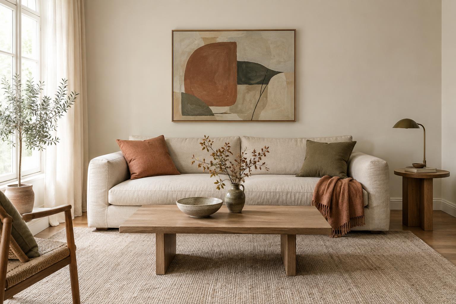
A room can feel abrupt when equally large areas of very light and very dark colour compete for attention. Giving one side a leading role usually makes the arrangement easier to read. In a light room, walls and large upholstery might stay pale while a dark cabinet, picture frames and a few smaller details provide definition. In a darker room, a pale rug, bedding or curtains can offer a generous area of relief.
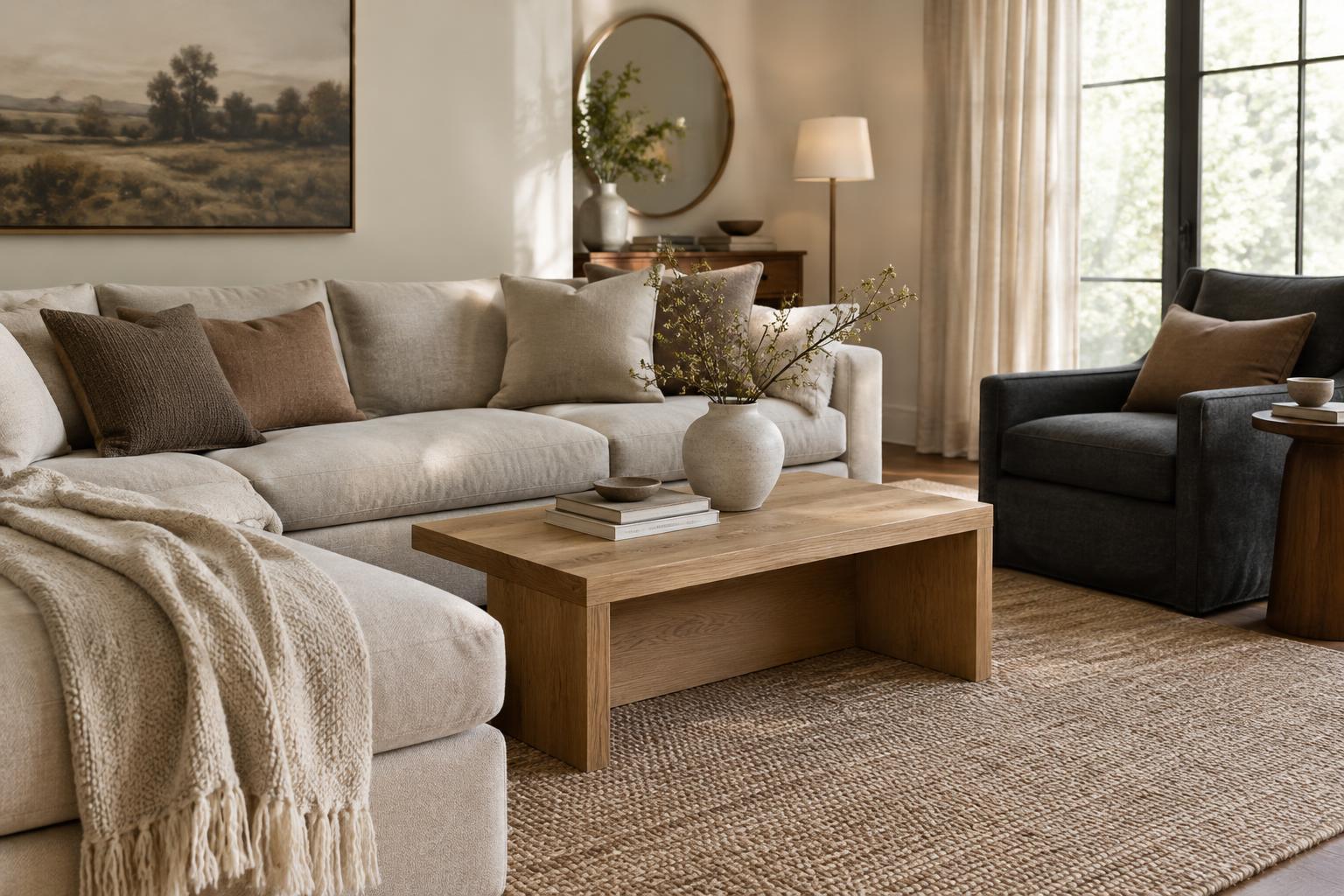
You do not need to replace furniture to change the balance. If a dark sofa feels too heavy against a light wall, try a mid-toned throw and cushions that connect it to the rest of the room. If a pale room feels flat, add contrast at several scales: perhaps one substantial dark object, followed by smaller touches elsewhere. Repeating a dark tone can make it look intentional rather than isolated.
Use middle tones and texture to soften the edges
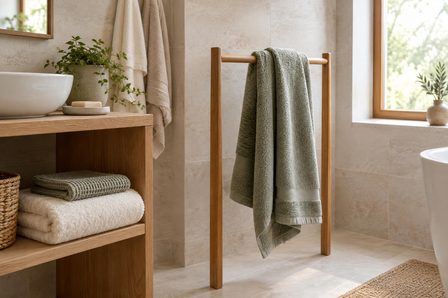
The gentlest contrasts often include colours between the two extremes. Oatmeal, stone, warm grey, muted green or natural wood can bridge an off-white wall and a charcoal armchair. These middle tones do not have to appear in equal amounts. A rug, lampshade or pair of cushions may be enough to make the shift feel gradual.
Texture changes how contrast is perceived, too. A matte dark finish tends to look quieter than a glossy one, while woven fabric and visible wood grain add variation to an otherwise solid colour. Against a smooth pale wall, a dark linen curtain may feel softer than a sharply reflective surface. Mixing finishes can be useful, but keep some continuity: repeating one wood tone or fabric texture helps the room feel connected.
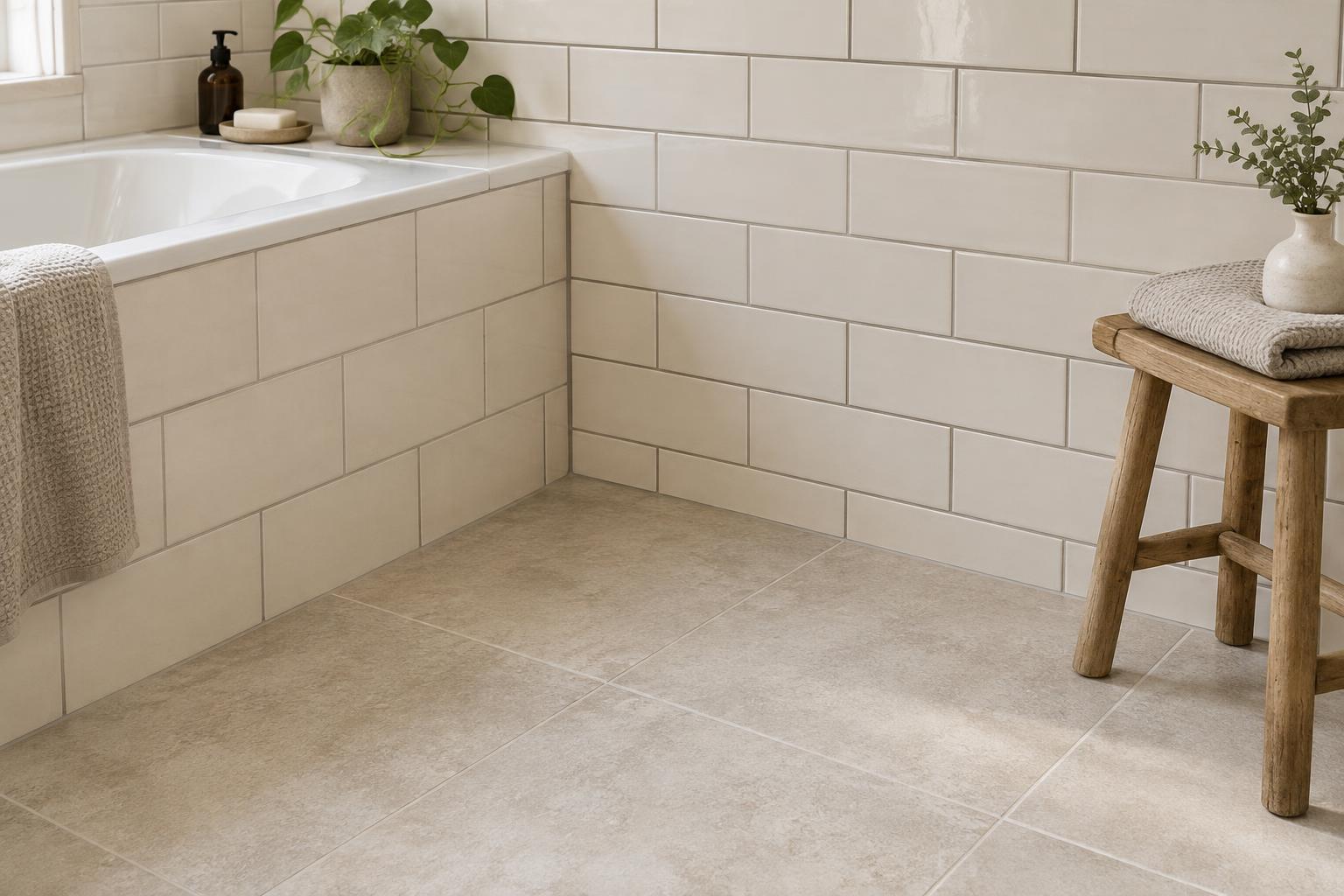
Pay attention to undertones when pairing materials. A creamy white and a warm brown often sit comfortably together, while a cool white next to a very warm wood may make their difference more noticeable. That difference is not necessarily wrong; it is simply worth checking with samples in the room before committing to a large purchase or paint choice.
Place contrast where it helps the room
Contrast can guide the eye. A dark frame around pale artwork, a deep-coloured vase on a light shelf or a light cushion on a dark chair gives a particular area a clear outline. Choose a few places you want people to notice, rather than creating a strong light-dark edge at every turn. Leaving quieter areas gives the eye somewhere to rest.
Consider what sits directly beside each colour. A black side table against a white wall creates a stronger edge than the same table beside a medium-toned curtain or timber floor. If an arrangement feels too sharp, you may not need to change either item. Placing a plant, woven basket or softly coloured textile nearby can ease the transition. Keep practical visibility in mind as well: stairs, doorways and work surfaces should remain easy to distinguish.
Check the effect in your room’s light
Light changes the strength of contrast throughout the day. A dark paint or fabric may look rich near a window but much deeper in a shaded corner. Pale surfaces can also appear brighter under a lamp than they do in daylight. Before making a large change, place samples beside the flooring, furniture and textiles they will meet, then look at them under the lighting you normally use.
If the room feels harsh in the evening, try adjusting the light before changing the whole palette. Several lamps can give you more control than relying on one bright overhead fitting. Light directed towards a wall may soften the boundary between a dark piece of furniture and its surroundings. Start with small, movable elements, assess how the room feels at different times, and build on the contrasts that make it feel both clear and comfortable.