What the 60-30-10 rule actually means
The 60-30-10 rule divides a room’s visible colour into three rough proportions. About 60 percent is a dominant colour that sets the overall mood, 30 percent is a secondary colour that adds contrast or depth, and 10 percent is an accent that draws the eye. The figures are a planning guide, not a measuring exercise. You do not need to calculate the exact area of every wall, cushion and chair.
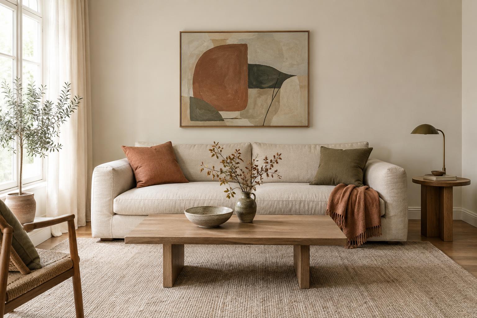
A room with warm off-white walls, a similar-coloured rug and pale curtains might use those surfaces as its dominant 60 percent. A tan sofa and timber furniture could form the supporting 30 percent. Blue cushions, a vase and a small artwork detail could supply the final accent. The result works because the blue appears more than once, while the larger, quieter areas give it space to stand out.
Start with what already takes up space
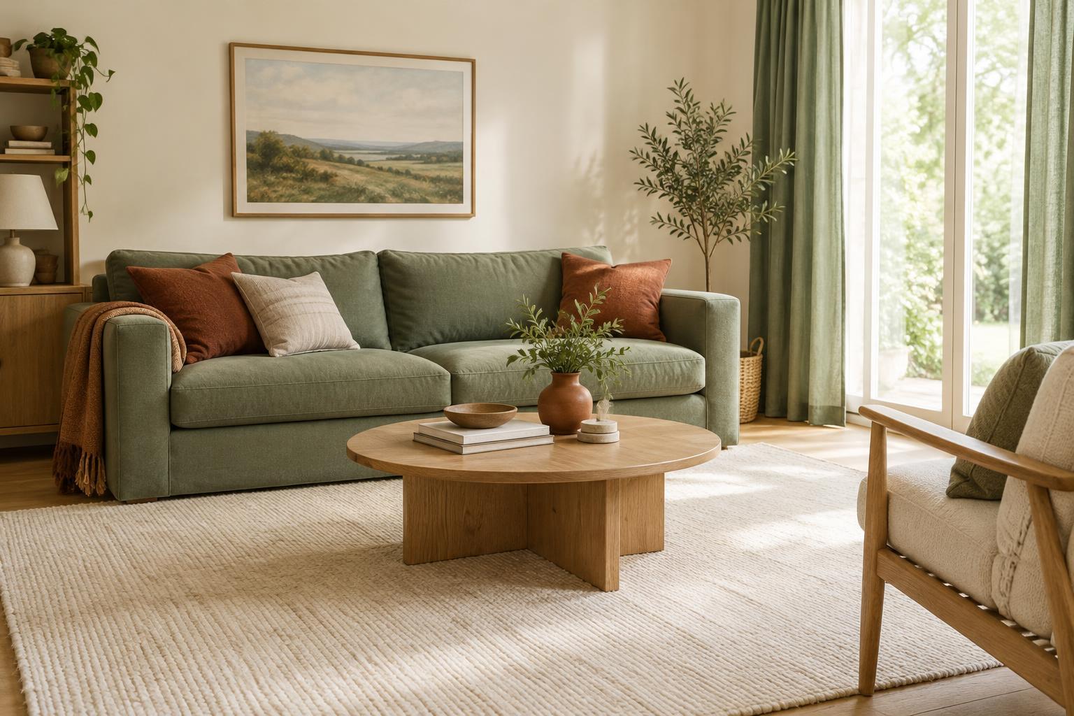
Before choosing paint or accessories, look at the surfaces you are likely to keep. Flooring, a sofa, kitchen cabinets or a large rug may already determine much of the room’s colour balance. If a dark green sofa is the largest visual feature, it can be the dominant colour even if it covers less physical area than the walls. Pay attention to visual weight as well as size: deep, saturated colours tend to attract more notice than pale ones.
Decide which existing element you want to lead, then choose two colours that relate to it. For example, a room with a terracotta floor could use warm cream as its dominant colour, muted terracotta as the secondary colour and a small amount of olive green as an accent. This approach lets the fixed finish feel intentional rather than like an obstacle you have to disguise.
Give each colour a clear job
The dominant colour usually works best on broad surfaces such as walls, large upholstery, curtains or a rug. It does not have to be white or beige; a gentle sage or dusty blue can also create a calm background. If you want a strong colour on the walls, consider whether the larger furniture and textiles can provide enough quiet space to balance it.
Use the secondary colour to connect the background to the furnishings. It might appear on a sofa, dining chairs, bedding or substantial pieces of furniture. Save the accent for smaller, easier-to-change items such as cushions, lampshades, decorative objects or artwork details. Repeating that accent in two or three places helps it look deliberate, but the objects need not match exactly. A mix of lighter and darker versions of one colour can feel more relaxed.
Make room for materials, patterns and light
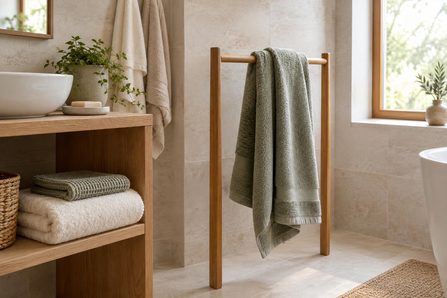
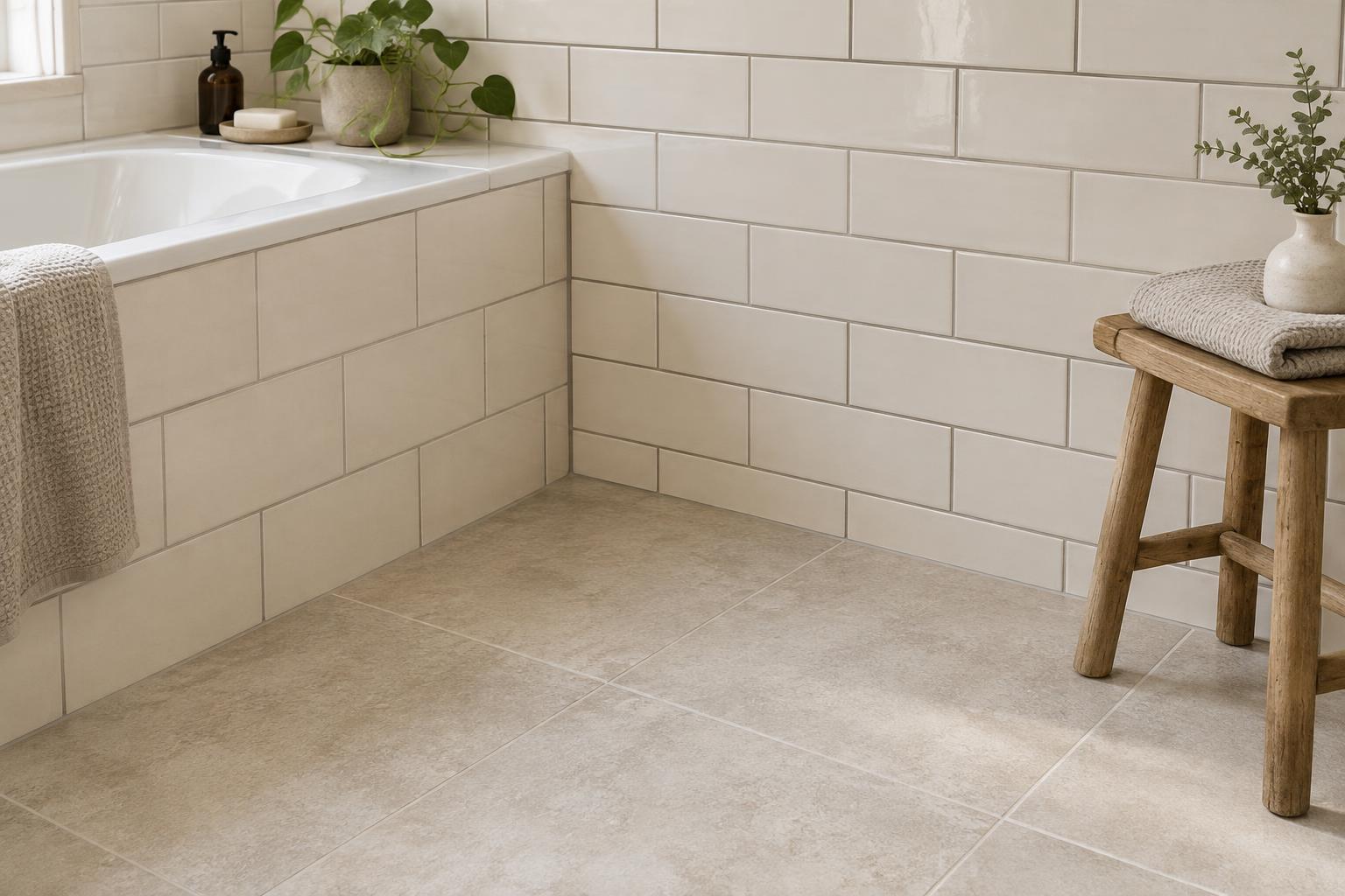
Materials contribute colour even when you think of them as neutral. Oak, walnut, brass, black metal and woven fibres all affect the palette. You can group similar finishes within one of your three colour families rather than treating every material as a new accent. If a room already contains several wood tones, look for a shared warmth or repeat one finish elsewhere to make the mix feel connected.
Pattern can also carry more than one part of the scheme. A patterned curtain might combine the dominant background shade with a little of the accent colour, tying together areas that would otherwise seem separate. Check your choices in the room at different times of day, since daylight and lamps can change how a shade appears. Sample paint on more than one wall, and place fabric swatches beside the furniture and flooring they will sit near.
Adjust the balance to suit the room
Some spaces need a softer division than 60-30-10. In a small room with busy flooring or detailed upholstery, keeping the secondary and accent colours close in tone may feel calmer than introducing sharp contrast. In a room with simple furniture and plain walls, a brighter accent can provide energy without taking over. The aim is a clear visual hierarchy, not perfect arithmetic.
If the palette feels flat, try strengthening the difference between the dominant and secondary colours or adding texture within the dominant colour. If it feels restless, reduce the number of unrelated accent shades and repeat one of the existing colours instead. Change one element at a time, starting with movable items, so you can see what improves the room before committing to paint or larger purchases.