Start with the room, not the wheel
A colour wheel is a useful guide to relationships between colours, but it cannot tell you what your room needs on its own. Before choosing a palette, look at what will stay: flooring, a sofa, kitchen cabinets, tile or a large rug. Notice whether these surfaces seem warm, cool, light or dark. A pale oak floor and a charcoal sofa, for example, will give the same wall colour very different surroundings.
Next, decide how you want the room to feel and where you want the eye to go. A quiet reading room might call for gentle shifts between related colours. A lively dining area might suit a sharper contrast. Choose one starting colour from something you love or plan to keep, such as an artwork, patterned cushion or upholstered chair. You can then use the wheel to find colours that work with it.
Learn what the colour wheel can show you
On a basic colour wheel, colours are arranged in a circle. Neighbours, such as blue and green, are closely related; colours across from one another, such as blue and orange, create stronger contrast. The wheel shows hue—the colour family—but a room scheme also depends on how light, dark, muted or vivid each choice is. Soft terracotta and bright orange sit in a similar part of the wheel, yet they make very different companions for blue.
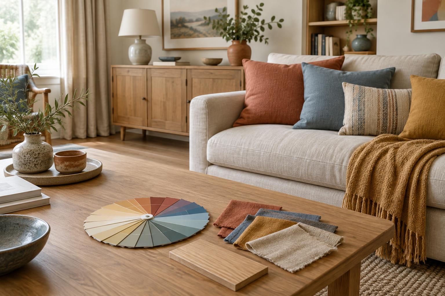
It also helps to think about temperature. Reds, oranges and yellows often read as warm, while blues and many greens often read as cool. These are useful descriptions, not strict rules: a green can lean yellow and feel warmer, while another can lean blue and feel cooler. When choosing paint, fabric or accessories, compare actual samples rather than relying only on colour names.
Choose a simple relationship between colours
For a calm, connected look, try an analogous scheme: pick two or three neighbouring colour families. Blue, blue-green and green could appear in a rug, curtains and a few smaller objects. To keep the result from feeling too uniform, vary the lightness and texture. A deep blue cushion, faded green linen and a pale blue-grey wall can offer more interest than three equally bright shades.
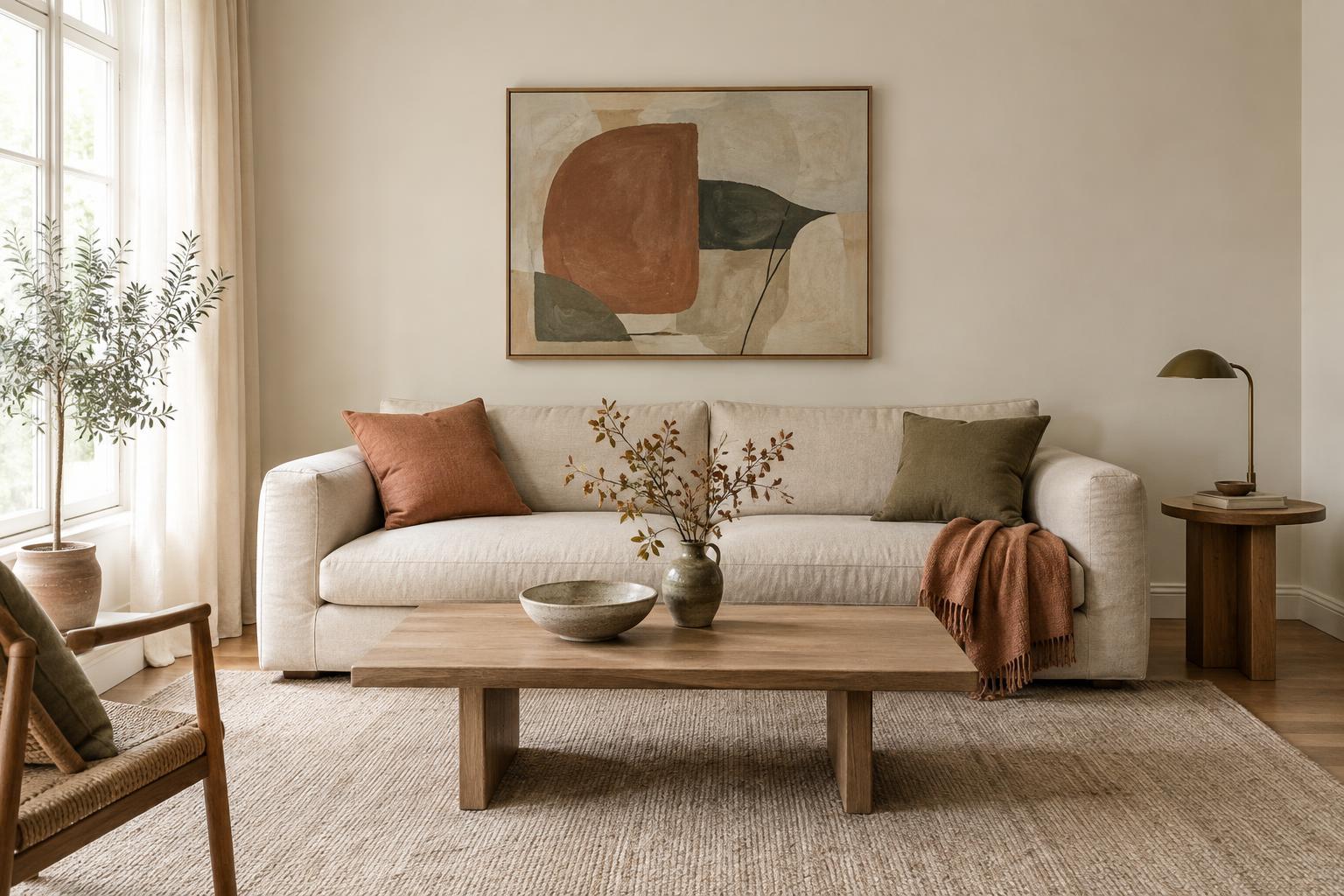
For greater energy, try complementary colours from opposite sides of the wheel. The key is not to use both at full strength everywhere. Let one colour lead and bring in the other through a smaller piece, such as a lamp base, throw or artwork. A muted blue room with touches of rust, for instance, can feel balanced without looking like a set of matching blocks.
A monochromatic scheme is another option: work with lighter and darker versions of one colour family. It can be especially useful when you want a restful backdrop but do not want an all-neutral room. Layering different materials—paint, woven fabric, ceramic and wood—helps a single-colour scheme feel inviting.
Give each colour a job
Once you have chosen a relationship, assign roles rather than spreading every colour evenly. A main colour can cover walls or large furnishings. A supporting colour can appear on curtains, a rug or an armchair. A contrasting accent can be reserved for objects that are easy to move or replace. This approach gives the eye somewhere to rest and makes it easier to refresh the room later.
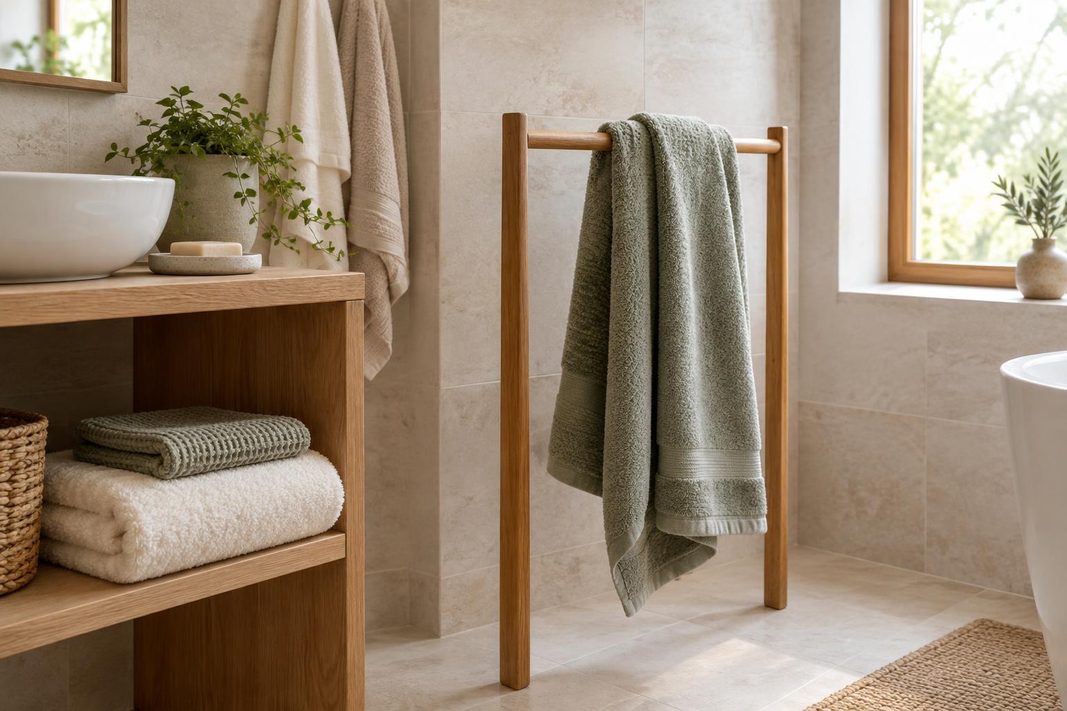
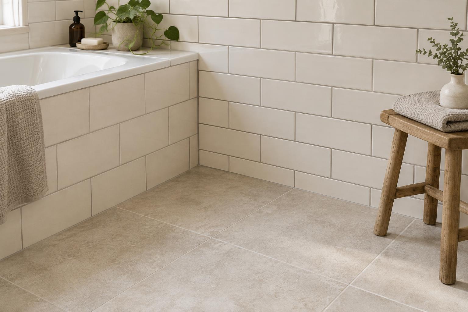
Neutrals and natural materials are part of the scheme, too. White, cream, grey, beige and brown all have undertones that can affect neighbouring colours. A creamy white may sit comfortably beside ochre and warm wood, while a crisp, cooler white may change how those finishes appear. You do not have to match every undertone exactly, but placing samples together will reveal combinations that feel uneasy to you.
Think about value—the lightness or darkness of a colour—as well as hue. If the sofa, walls and rug are all similarly mid-toned, their outlines may blur even when their colours differ. A lighter wall, darker table or patterned textile can create definition without adding another colour family.
Test the palette in the space
Before committing to a large painted area or expensive fabric, gather samples and view them together in the room. Look at them beside fixed finishes and at different times of day. Daylight, lamps and shadows can all change how a shade appears. If possible, move a paint sample between walls; a colour near a window may look different in a shaded corner.
Finally, step back and check the whole room rather than judging each choice in isolation. Does one colour dominate as intended? Is the contrast comfortable? Do the materials add enough variety? If something feels off, adjust one element at a time—perhaps a softer accent, a darker textile or a warmer neutral. The colour wheel gives you a starting structure; the room and your own eyes make the final decision.