Why finish matters as much as colour
Two surfaces painted the same colour can look surprisingly different. Finish determines how much light a surface reflects and how clearly that reflection appears. Matte scatters light gently, gloss produces more distinct reflections, and satin sits between them. These differences affect not only how bright a colour seems, but also which shapes and textures catch your eye.
Consider a deep blue wall. In a matte finish, it may look calm and even, allowing nearby textiles or artwork to stand out. In gloss, the same blue can feel more animated as windows and lamps appear on its surface. Neither effect is inherently better. The useful question is what you want to notice when you enter the room: the colour itself, the surface’s texture or the changing light.
Matte: soft colour with less reflection
A matte finish has little visible shine, so it tends to give a surface a quiet, soft-edged appearance. It works well when you want a large wall or piece of furniture to provide a backdrop rather than draw attention to itself. On painted walls, reduced reflection can make small bumps less noticeable from a distance, although strong side lighting may still reveal them.
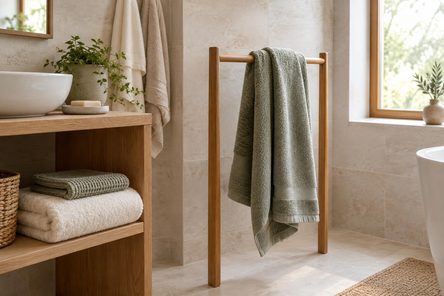
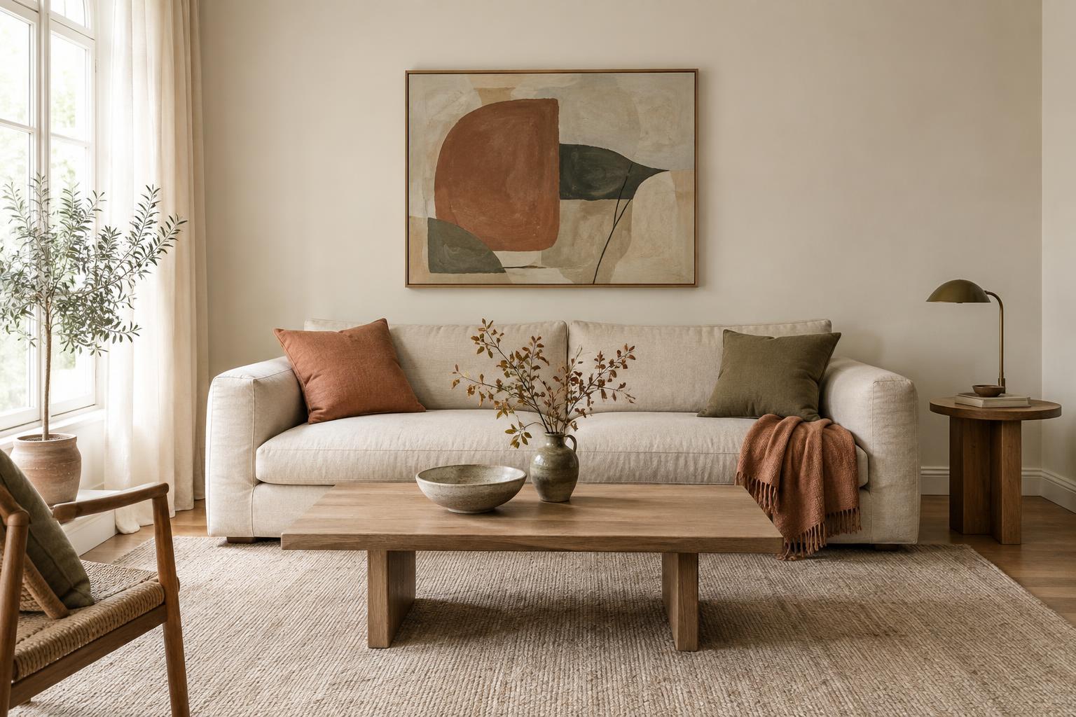
Matte can be especially effective with earthy colours, chalky neutrals and darker shades, where its low sheen helps emphasise depth. It also pairs naturally with woven curtains, linen cushions, timber and other materials with visible texture. If everything in a room is matte, however, the scheme can feel a little flat. A mirror, glazed vase or modest metallic detail can provide contrast without changing the room’s overall softness.
Do not assume every matte product behaves alike in daily use. Cleaning and mark resistance vary by material and product. For a surface that will be touched often, check the care guidance and, if possible, test how a sample responds to gentle wiping before committing.
Satin: a restrained sheen for everyday spaces
Satin has a subtle glow rather than a mirror-like shine. It catches light enough to give edges and curves definition, but its reflections are usually less prominent than gloss. That makes it a flexible choice when you want a surface to feel polished without becoming the focal point of the room.
On trim, doors or cabinetry, satin can create a gentle contrast with matte walls even when both share a similar colour. The change in sheen outlines architectural details without requiring a bold colour difference. Satin can also bridge materials: it often sits comfortably alongside both rougher textures, such as woven baskets, and smoother ones, such as glass or glazed ceramic.
The word “satin” is a helpful starting point, not a precise guarantee of appearance. Sheen can vary between products, and the effect changes with lighting and viewing angle. Compare actual samples in the room, particularly if you are trying to match an existing painted or manufactured surface.
Gloss: clear reflections and stronger emphasis
Gloss reflects light more distinctly, drawing attention to the surface it covers. On a small object, such as a tray or lamp base, that shine can make a simple shape feel deliberate. On a larger area, it can add energy and visual movement as reflections shift throughout the day. A glossy finish may make colour appear more vivid in some lighting, though it can also pick up the colours of nearby objects.
Because gloss highlights reflections, it can also reveal uneven preparation, fingerprints or dust more readily, depending on the surface. A glossy cabinet door, for example, asks for a different kind of upkeep than a matte one. Before choosing gloss for a large area, think about what will be reflected in it. A window or attractive light fitting may add interest; a busy view across the room may make the finish feel visually restless.
Gloss often works best when its role is clear. Repeating it in a few small places, rather than on every surface, can make those details feel connected.
How to choose and combine finishes
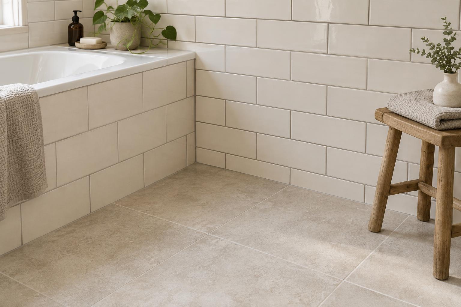
Start with the surface’s job. For a broad, restful backdrop, consider matte. For a softly defined door, shelf or cabinet, try satin. For an accent you want people to notice, consider gloss. Then look at the room’s existing materials. A space with shiny tiles, glass and metal may benefit from a matte element to soften the mix; a room full of flat finishes may welcome a little sheen.
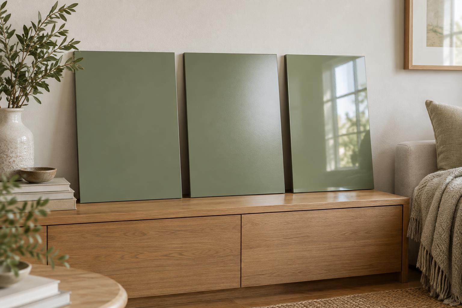
Test samples where the finish will actually be used. Look at them in daylight and under the room’s lamps, both straight on and from the side. If you are choosing paint, apply a sample large enough to see a reflection rather than judging only from a tiny swatch. Check it beside curtains, flooring and furniture, since neighbouring colours and textures influence the result.
A useful approach is to let one finish dominate and use the others for contrast. Matte walls, satin woodwork and a few glossy objects create variation without demanding that every detail match. The goal is not to follow a fixed formula, but to choose where you want light to settle and where you want it to sparkle.