Start with the feeling, not the colour name
A neutral backdrop gives furniture, textiles and decorative objects room to stand out. But “neutral” does not mean without character. A cream wall may feel soft and welcoming, while a pale grey can feel crisp and quiet. Neither is automatically better: the useful question is what you want the room to feel like alongside the things already in it.
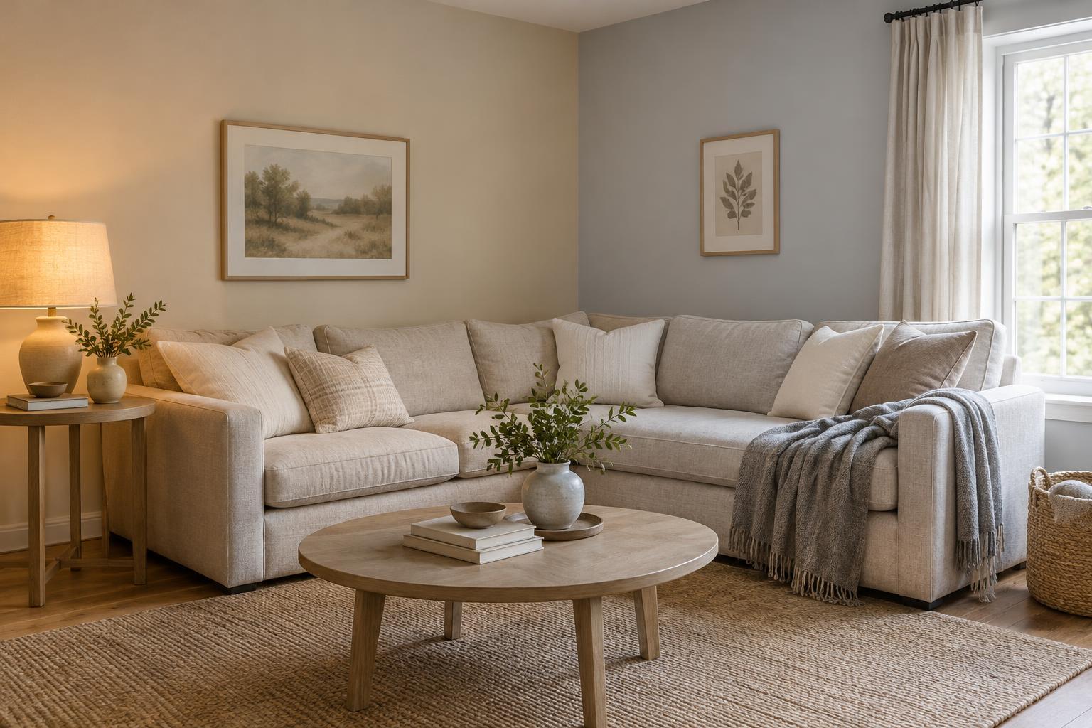
Warm neutrals tend toward yellow, peach, pink or brown. Think ivory, oatmeal, sand and many beiges. Cool neutrals tend toward blue, green or violet, as can happen with some whites and greys. The labels on samples are not always reliable guides to these undertones. Comparing two colours side by side often reveals a difference that is hard to see when you look at either one alone.
Let fixed finishes narrow the choices
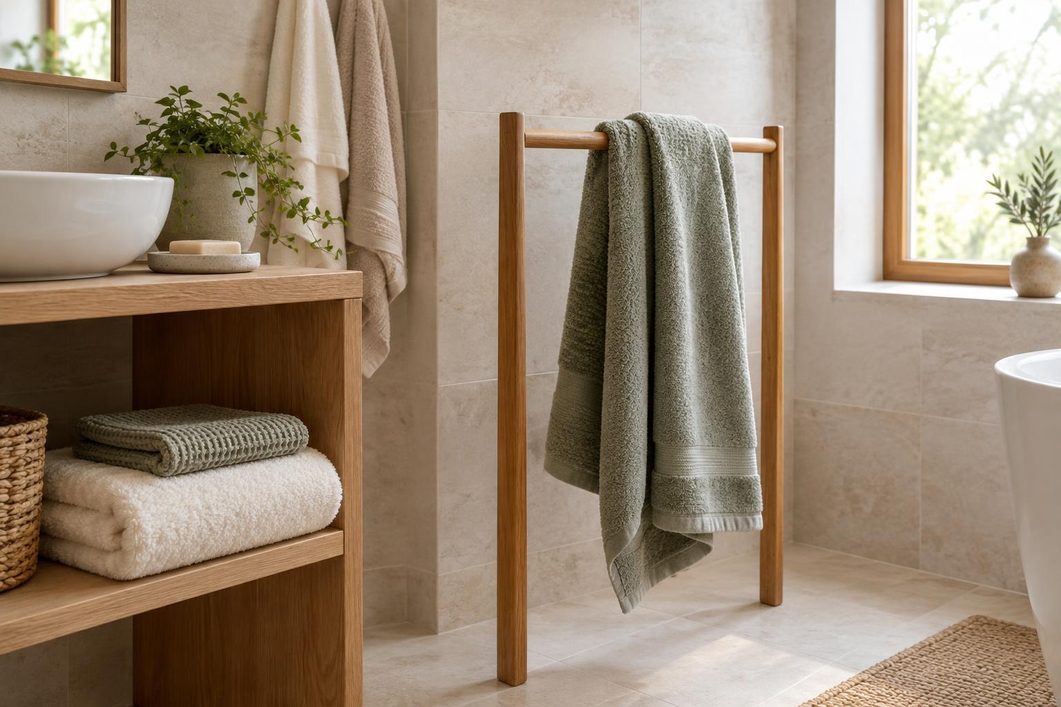
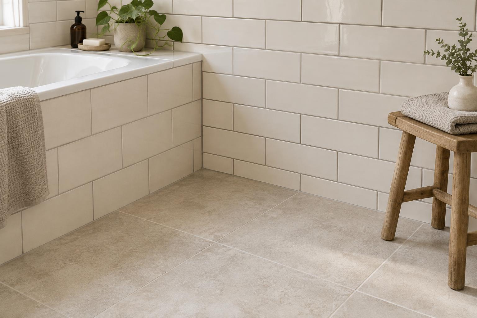
Before choosing a paint colour or large rug, look at the elements that will stay: flooring, tiles, countertops, built-in cabinets and substantial furniture. Note whether each surface reads warm or cool, and whether its colour is subtle or pronounced. Honey-toned wood and creamy stone, for example, may sit comfortably with warm off-white. Blue-grey tile may look more settled beside a cooler neutral.
You do not have to match every undertone. Contrast can be appealing when it looks deliberate. If a room contains both warm wood and a cool stone surface, try a restrained neutral that does not strongly echo either one. Then use smaller pieces, such as cushions or a throw, to repeat colours from both finishes. This helps mixed materials feel connected without forcing the whole room into one temperature.
Check what daylight and lamps do
The same sample can look different from room to room. Daylight may make a cool undertone more noticeable in one space, while warm artificial light can soften it in another. Shadowed corners can also make pale colours appear deeper than expected. Rather than relying on a photograph or a sample viewed in a shop, bring candidate colours into the room where they will be used.
Place generous samples beside the floor, sofa and window coverings. Look at them in the morning, later in the day and with your usual lamps on. Move them to more than one wall if the light varies around the room. If one neutral looks pleasant only at a particular hour but turns muddy or stark for the rest of your day, keep looking. A backdrop should work under the conditions in which you actually use the space.
Choose a backdrop for your furnishings
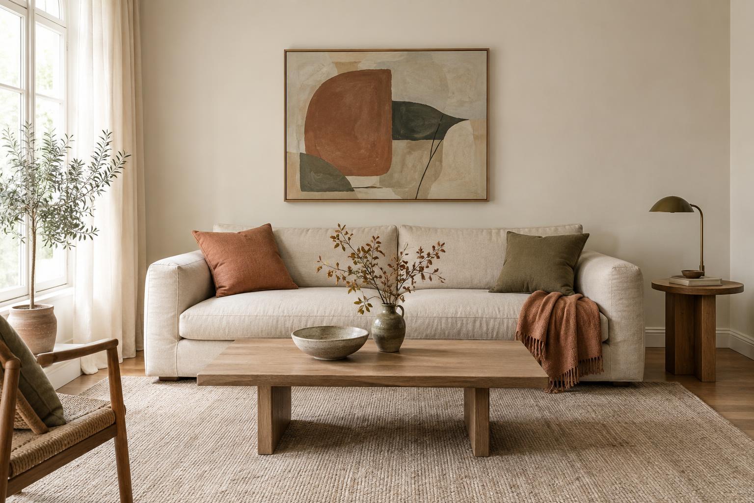
A backdrop does not need to share the temperature of every object in the room. It does need to give the dominant furnishings some breathing room. With a tan leather chair, rust cushions and natural fibres, a warm neutral can create an easy, layered effect. With blue upholstery, charcoal accents and cooler metals, a cooler neutral may provide a clearer setting. These are starting points, not rules: the exact shade and amount of contrast matter more than a warm-or-cool label.
Pay attention to depth as well as undertone. A pale wall against a pale sofa can look calm, but it may need contrast from darker wood, patterned textiles or distinct textures. A deeper neutral can make lighter pieces feel more defined. If you are uncertain, keep the largest surfaces relatively quiet and bring stronger warm or cool notes into items you can change easily, such as cushion covers, a throw or decorative objects.
Make the final decision with a simple test
Narrow your options to a few neutrals rather than comparing a crowded stack of samples. Set each one next to a plain white reference to make its undertone easier to notice, then remove the reference and judge the colour in the room. A sample that seems appealing on its own may clash when placed against a floor or curtain, so check those pairings before deciding.
For paint, test a large patch or a movable sample board and allow the finish to dry before judging it. For textiles, take a swatch to the sofa or hold it against the intended wall. Ask whether the choice supports the room’s fixed finishes, looks comfortable in your usual light and leaves room for the colours you enjoy. The right neutral is not the one with the most fashionable name; it is the one that makes the room’s existing pieces easier to live with.